- How To Reset WordPress Installation?
- XMLReader Support Missing – Starter Templates
- cURL Support Missing – Starter Templates
- Required File Permissions Missing – Starter Templates
- Disable Debug Mode – Starter Templates
- Update Required Plugins – Starter Templates
- How to Import A Complete Site With Starter Templates?
- Starter Templates — Basics and FAQs
- How to Import Single Page With Starter Templates?
- Starter Templates with Other Themes
- How to Translate Astra Theme / Plugins in Your Own Language using GlotPress?
- How to Turn Astra Multilingual with WPML?
- How to Translate Custom Layouts with WPML?
- How to Translate Astra Strings with WPML?
- How Translations can be Manually Exported and Uploaded to the Site?
- How to Turn Astra Website Multilingual with Polylang?
- How to Translate Categories, Tags, and Astra Strings with Polylang
- How to Turn Astra Website Multilingual with TranslatePress?
- How to translate the WooCommerce string?
- Astra theme string translation for WooCommerce
- How to Change the Default Astra Strings
- Using Hooks in Astra
- How to Change the “Scroll To Top” Icon in Astra?
- Astra Pro WP CLI Commands
- How to Add Custom PHP Code?
- How to Disable the Loading of Astra’s Default Font File? (Astra.woff)
- Disable Featured Image on Posts, Pages, or Other Post Types
- Change Sidebar Widget Title Heading Tag
- Disable Astra’s Native AMP Functionality
- Disable All Meta Settings of Page/Post by Default
- How to Display “Last Updated” instead of “Published” Date
- How to Change Previous and Next Link Text from a Single Blog Post?
- How to Remove Featured Image Link on Archive Page?
- Filter to Remove Link From Featured Images on Blog Page
- Blog Featured Image Size Not Working / Error in Image Processing Library
- How To Change Navigation Links Text for a Blog Archive?
- How to Display the Post Category as a Related Posts Title?
- Change “Leave A Comment” title tag
- Customizing Social Profile Links for Individual Authors in Single Posts
- Change Woocommerce Out of Stock Text
- How to Disable Product Quantity (Plus-Minus) Buttons?
- How to Modify/Change the Quick View text?
- Filter to Add Global Button Settings Support for WooCommerce Buttons
- Change the “Shopping Cart” Text for WooCommerce & EDD Mobile Header Cart
- Fix Woocommerce Cart Becoming Transparent With Header Builder
- Restrict Search Results to WooCommerce Products Only
- How To Hide Quantity Number When the Woocommerce Cart Is Empty?
- Remove Astra Customization for WooCommerce
- Remove Woocommerce Product Category Archive Title
- How to Change Website Logo Destination URL
- Remove Primary Navigation Menu with Hook
- Change the Astra Header Breakpoint Width
- How to Disable Primary Header?
- Add Title attribute to Header Background Image as a Substitute for Alt Text
- How to Change HTML tag for Site Title and Tagline?
- How to Change the Heading Tag for the Page/Post Titles?
- Change the String “Search Results For”
- Change Placeholder for Search Box (Old Astra Header)
- How to Update Responsive Breakpoints for Tablet+Mobile in Astra?
- Fix Swap Sections Not Working on Mobile (Old Astra Header)
- How to Remove Google Fonts Suggestions in Astra Theme?
- Remove default stretched block layout spacing
- How to Change the Logo on Specific Pages?
- How to remove horizontal & vertical gallery layouts from a single product page?
- Introducing New Filter to Enable/Disable Rank-Math Theme Support
- How to Fix the Line Height Unit being converted to “EM”?
- How to Change WordPress Post labels to Projects
- Managing User Roles and Permissions for the Gutenberg Template Library
- Footer Custom Text Helper Strings
- Does Astra support Beaver Themer Plugin?
- Increasing the PHP Memory Limit of Your Website
- How to Disable Header or Footer for a Landing Page or Post?
- Where Does Astra Primary Color Setting Take Effect?
- How to Adjust the Width of Your Sidebar?
- How to Update the Plugin Manually from WordPress Backend?
- Recommended Settings for Elementor and the Astra Theme
- Recommended Settings for Beaver Builder and the Astra Theme
- Astra Pro WP CLI Commands
- Why Is My Logo Blurry?
- How to Update Responsive Breakpoints for Tablet+Mobile in Astra?
- FAQs – Astra Header/Footer Builder
- Elements in Header/Footer Builder With Astra Theme and Astra Pro
- Add Multiple Elements in Header Footer Builder
- How To Create a Header With Astra Header Builder?
- How To Create a Footer With Astra Footer Builder?
- How To Create Mobile Header With Astra Header Builder?
- FAQs – Astra Header/Footer Builder – Existing Customers
- Clone and Delete Elements in Header Footer Builder
- Global Container – Astra Theme
- Boxed – Container Layout
- Content Boxed – Container Layout
- Full Width / Contained – Container Layout
- How to Set the Full-width/Stretched Container Layout in Astra?
- Global Colors – Astra Theme
- Global Typography – Astra Theme
- Typography Improvement for Astra
- Astra Global Color Palette
- Astra Typography Presets
- Blog Overview
- Blog / Archive
- Single Post
- How to Display “Last Updated” instead of “Published” Date
- Display Related Posts on Single Blog Post
- The Recommended Size for Featured Image Upload
- How to remove an Author’s name from a Single Blog Post?
- How to Remove Astra Post Excerpt from the Post Archive
- Add Last Updated or Published Date to Blog Posts
- Enhanced Blog Experience: Explore What’s New in Astra v4.6.0
- Astra – Customize the submenu
- The blank screen in the Customizer area
- How to use the color palette of the Astra theme
- How to Import / Export Astra Customizer Settings
- How to disable logo cropping
- How to Create a Sticky Sidebar for Your WooCommerce Shop Page
- How to use dynamic customizer from Astra 4.0.0
- How to Change the Typography of the Astra Menu
- What is Astra Pro Add on?
- What Is a Child Theme and How To Install It for Astra?
- How to Activate Astra Pro Addon License?
- How to Get License Key of Astra Pro?
- How to Install Astra Pro Plugin?
- Getting Started with Astra Pro Addon Plugin
- Getting error – The package could not be installed. The theme is missing the style.css stylesheet?
- Do Not See License Activation Form for Astra Pro Addon Plugin?
- How to Install Astra Theme?
- Know More about Astra Beta Versions? How to Download and Use?
- Custom Layouts Overview
- Cannot edit Custom Layouts / Custom Layouts having 404 error?
- Custom Header
- Custom Footer
- Site Builder – Hooks
- Custom 404 Page
- How to Translate Custom Layouts with WPML?
- Display Settings of Custom Layouts in Astra Pro
- Inside Page/Post Content Custom Layouts
- Quick admin bar navigation to edit custom layout & page header
- Astra WooCommerce Mini Cart Shortcode
- WooCommerce Module Overview
- How to Design a Product Catalog Page or Shop Page Using WooCommerce Module in Astra?
- Single Product WooCommerce
- Checkout Page WooCommerce
- Colors & Background options for WooCommerce
- Typography Options for WooCommerce
- How to Add WooCommerce Mini Cart in Header? (Old Astra Header)
- Off-Canvas Sidebar for WooCommerce Shop Page
- Quick View for WooCommerce Products
- How to Disable EDD Inbuilt Styling?
- How to Add Download Archive Pages to the Menu When Using Astra with EDD?
- How to Add EDD Cart in Header? (Old Astra Header)
- How to Display a Mini Cart Anywhere Using Shortcode? (Astra and EDD)
- EDD – Easy Digital Downloads Module Overview
- General – EDD Module Options
- Product Archive – EDD Module Options
- Single Product – EDD Module Options
- Checkout Page – EDD Module Options
- Colors & Background options for EDD
- Fix for – The PCLZIP_ERR_BAD_FORMAT (-10) Error
- Fix for – Parse error: syntax error, unexpected T_FUNCTION
- How to fix Fatal Error / White Screen of Death?
- Fix for- cURL error 51: SSL: no alternative certificate subject name matches target host name ‘websitedemos.net’
- Getting error – The package could not be installed. The theme is missing the style.css stylesheet?
- ‘The preview could not be loaded’ Pop Up with Astra and Elementor
- Troubleshooting Steps ( with Health Check & Troubleshooting plugin )
- How to Deal with Update Issues in Astra Theme and Astra Pro Addon?
- Blog Featured Image Size Not Working / Error in Image Processing Library
- How to Clear Astra’s Cache?
Max Width Site Layout
This is a premium feature available with the Astra Pro Addon plugin. To use these Pro features, you need to have the Astra theme along with the Astra Pro Addon installed on your website.
Please refer to the following document, to begin with, Site Layout.
A website generally has the main wrapper followed by the container.
- The main wrapper consists of a header, content, sidebar, and footer — the entire website;
- And the container is the child wrapper that includes content & sidebar.
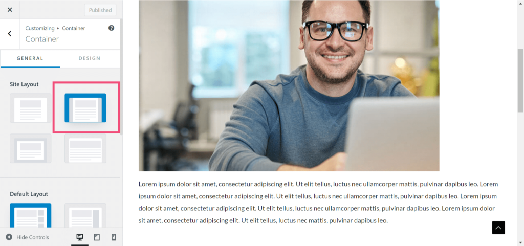
In Max Width Site Layout, the main wrapper of the website is set to a certain maximum width. We have also provided settings for you to control the top and bottom margins, so you can design your website to appear like a real box.
You can find the setting to manage Max Width Site Layout under Appearance > Customize > Global > Container > Site Layout

Other Notes:
If you need to set a background image for the entire site please check this document: Global Colors – Astra Theme.
What is the difference between Full Width Site Layout and Max Width Site Layout?
Full-Width Site Layout refers to a layout option where the content of your website spans across the entire width of the browser window, from edge to edge. This means that there are no visible margins or sidebars on the left or right side of the content area. The content takes up the full available space, allowing you to showcase your content in a wider format. It provides a more immersive and modern look, especially on larger screens.
On the other hand, Max Width Site Layout refers to a layout option where the content of your website is constrained to a specific maximum width, regardless of the width of the browser window. This means that there will be visible margins or sidebars on the left and right side of the content area, creating a more contained and focused appearance. The content is centered within the specified maximum width, providing a more traditional and conservative design.
The choice between these two layout options depends on your website’s goals and aesthetics. Full-Width Site Layouts are often used for websites that want to make a bold statement or showcase visual elements with more impact. They work well for portfolios, photography websites, or sites that prioritize a visually immersive experience. On the other hand, Max Width Site Layouts are commonly used for content-focused websites, blogs, or sites that aim for a more structured and organized presentation.
We don't respond to the article feedback, we use it to improve our support content.
