- Fix for – The PCLZIP_ERR_BAD_FORMAT (-10) Error
- Fix for – Parse error: syntax error, unexpected T_FUNCTION
- How to fix Fatal Error / White Screen of Death?
- Fix for- cURL error 51: SSL: no alternative certificate subject name matches target host name ‘websitedemos.net’
- Getting error – The package could not be installed. The theme is missing the style.css stylesheet?
- ‘The preview could not be loaded’ Pop Up with Astra and Elementor
- Troubleshooting Steps ( with Health Check & Troubleshooting plugin )
- How to Deal with Update Issues in Astra Theme and Astra Pro Addon?
- Blog Featured Image Size Not Working / Error in Image Processing Library
- How to Clear Astra’s Cache?
- How To Reset WordPress Installation?
- XMLReader Support Missing – Starter Templates
- cURL Support Missing – Starter Templates
- Required File Permissions Missing – Starter Templates
- Disable Debug Mode – Starter Templates
- Update Required Plugins – Starter Templates
- How to Import A Complete Site With Starter Templates?
- Starter Templates — Basics and FAQs
- How to Import Single Page With Starter Templates?
- Starter Templates with Other Themes
- Scroll To Top
- Astra Theme Walkthrough
- This Is Your Customizer
- Style Your Website With Global Settings
- Build Your Header
- Find the Way With Breadcrumbs
- Set Up Your Blog
- Add Your Sidebars
- Build Your Footer
- See Other Customizer Options
- How To Build Quick Sites With Astra?
- Getting the Most Out of Astra Theme
- Host Google Fonts Locally – Performance Is the Key
- Improved Spectra Compatibility
- Introducing the new Disable Banner Area Meta-Based Option
- How to Translate Astra Theme / Plugins in Your Own Language using GlotPress?
- How to Turn Astra Multilingual with WPML?
- How to Translate Custom Layouts with WPML?
- How to Translate Astra Strings with WPML?
- How Translations can be Manually Exported and Uploaded to the Site?
- How to Turn Astra Website Multilingual with Polylang?
- How to Translate Categories, Tags, and Astra Strings with Polylang
- How to Turn Astra Website Multilingual with TranslatePress?
- How to translate the WooCommerce string?
- Astra theme string translation for WooCommerce
- How to Change the Default Astra Strings
- Using Hooks in Astra
- How to Change the “Scroll To Top” Icon in Astra?
- Astra Pro WP CLI Commands
- How to Add Custom PHP Code?
- How to Disable the Loading of Astra’s Default Font File? (Astra.woff)
- Disable Featured Image on Posts, Pages, or Other Post Types
- Change Sidebar Widget Title Heading Tag
- Disable Astra’s Native AMP Functionality
- Disable All Meta Settings of Page/Post by Default
- How to Display “Last Updated” instead of “Published” Date
- How to Change Previous and Next Link Text from a Single Blog Post?
- How to Remove Featured Image Link on Archive Page?
- Filter to Remove Link From Featured Images on Blog Page
- Blog Featured Image Size Not Working / Error in Image Processing Library
- How To Change Navigation Links Text for a Blog Archive?
- How to Display the Post Category as a Related Posts Title?
- Change “Leave A Comment” title tag
- Customizing Social Profile Links for Individual Authors in Single Posts
- Change Woocommerce Out of Stock Text
- How to Disable Product Quantity (Plus-Minus) Buttons?
- How to Modify/Change the Quick View text?
- Filter to Add Global Button Settings Support for WooCommerce Buttons
- Change the “Shopping Cart” Text for WooCommerce & EDD Mobile Header Cart
- Fix Woocommerce Cart Becoming Transparent With Header Builder
- Restrict Search Results to WooCommerce Products Only
- How To Hide Quantity Number When the Woocommerce Cart Is Empty?
- Remove Astra Customization for WooCommerce
- Remove Woocommerce Product Category Archive Title
- How to Change Website Logo Destination URL
- Remove Primary Navigation Menu with Hook
- Change the Astra Header Breakpoint Width
- How to Disable Primary Header?
- Add Title attribute to Header Background Image as a Substitute for Alt Text
- How to Change HTML tag for Site Title and Tagline?
- How to Change the Heading Tag for the Page/Post Titles?
- Change the String “Search Results For”
- Change Placeholder for Search Box (Old Astra Header)
- How to Update Responsive Breakpoints for Tablet+Mobile in Astra?
- Fix Swap Sections Not Working on Mobile (Old Astra Header)
- How to Remove Google Fonts Suggestions in Astra Theme?
- Remove default stretched block layout spacing
- How to Change the Logo on Specific Pages?
- How to remove horizontal & vertical gallery layouts from a single product page?
- Introducing New Filter to Enable/Disable Rank-Math Theme Support
- How to Fix the Line Height Unit being converted to “EM”?
- How to Change WordPress Post labels to Projects
- Managing User Roles and Permissions for the Gutenberg Template Library
- Footer Custom Text Helper Strings
- Does Astra support Beaver Themer Plugin?
- Increasing the PHP Memory Limit of Your Website
- How to Disable Header or Footer for a Landing Page or Post?
- Where Does Astra Primary Color Setting Take Effect?
- How to Adjust the Width of Your Sidebar?
- How to Update the Plugin Manually from WordPress Backend?
- Recommended Settings for Elementor and the Astra Theme
- Recommended Settings for Beaver Builder and the Astra Theme
- Astra Pro WP CLI Commands
- Why Is My Logo Blurry?
- How to Update Responsive Breakpoints for Tablet+Mobile in Astra?
- FAQs – Astra Header/Footer Builder
- Elements in Header/Footer Builder With Astra Theme and Astra Pro
- Add Multiple Elements in Header Footer Builder
- How To Create a Header With Astra Header Builder?
- How To Create a Footer With Astra Footer Builder?
- How To Create Mobile Header With Astra Header Builder?
- FAQs – Astra Header/Footer Builder – Existing Customers
- Clone and Delete Elements in Header Footer Builder
- Global Container – Astra Theme
- Boxed – Container Layout
- Content Boxed – Container Layout
- Full Width / Contained – Container Layout
- How to Set the Full-width/Stretched Container Layout in Astra?
- Global Colors – Astra Theme
- Global Typography – Astra Theme
- Typography Improvement for Astra
- Astra Global Color Palette
- Astra Typography Presets
- Blog Overview
- Blog / Archive
- Single Post
- How to Display “Last Updated” instead of “Published” Date
- Display Related Posts on Single Blog Post
- The Recommended Size for Featured Image Upload
- How to remove an Author’s name from a Single Blog Post?
- How to Remove Astra Post Excerpt from the Post Archive
- Add Last Updated or Published Date to Blog Posts
- Enhanced Blog Experience: Explore What’s New in Astra v4.6.0
- Astra – Customize the submenu
- The blank screen in the Customizer area
- How to use the color palette of the Astra theme
- How to Import / Export Astra Customizer Settings
- How to disable logo cropping
- How to Create a Sticky Sidebar for Your WooCommerce Shop Page
- How to use dynamic customizer from Astra 4.0.0
- How to Change the Typography of the Astra Menu
- What is Astra Pro Add on?
- What Is a Child Theme and How To Install It for Astra?
- How to Activate Astra Pro Addon License?
- How to Get License Key of Astra Pro?
- How to Install Astra Pro Plugin?
- Getting Started with Astra Pro Addon Plugin
- Getting error – The package could not be installed. The theme is missing the style.css stylesheet?
- Do Not See License Activation Form for Astra Pro Addon Plugin?
- How to Install Astra Theme?
- Know More about Astra Beta Versions? How to Download and Use?
- Custom Layouts Overview
- Cannot edit Custom Layouts / Custom Layouts having 404 error?
- Custom Header
- Custom Footer
- Site Builder – Hooks
- Custom 404 Page
- How to Translate Custom Layouts with WPML?
- Display Settings of Custom Layouts in Astra Pro
- Inside Page/Post Content Custom Layouts
- Quick admin bar navigation to edit custom layout & page header
- Astra WooCommerce Mini Cart Shortcode
- WooCommerce Module Overview
- How to Design a Product Catalog Page or Shop Page Using WooCommerce Module in Astra?
- Single Product WooCommerce
- Checkout Page WooCommerce
- Colors & Background options for WooCommerce
- Typography Options for WooCommerce
- How to Add WooCommerce Mini Cart in Header? (Old Astra Header)
- Off-Canvas Sidebar for WooCommerce Shop Page
- Quick View for WooCommerce Products
- How to Disable EDD Inbuilt Styling?
- How to Add Download Archive Pages to the Menu When Using Astra with EDD?
- How to Add EDD Cart in Header? (Old Astra Header)
- How to Display a Mini Cart Anywhere Using Shortcode? (Astra and EDD)
- EDD – Easy Digital Downloads Module Overview
- General – EDD Module Options
- Product Archive – EDD Module Options
- Single Product – EDD Module Options
- Checkout Page – EDD Module Options
- Colors & Background options for EDD
Build Your Header
The header is the top section of your website, shown across all (or almost all) pages and posts. It’s something that every website visitor sees first… your chance for a great first impression.
This is a place for visitors to meet your brand, your offer or idea, and to be initially delighted and intrigued to explore your website further.
Astra Theme Walkthrough Docs:
- Astra Theme Walkthrough
- This Is Your Customizer
- Style Your Website With Global Settings
- Build Your Header (currently reading)
- Find the Way With Breadcrumbs
- Set Up Your Blog
- Add Your Sidebars
- Build Your Footer
- Host Google Fonts Locally – Performance Is the Key
- See Other Customizer Options
- How To Build Quick Sites With Astra?
- Getting the Most Out of Astra Theme
Astra theme comes with a drag & drop Header Builder – a perfect tool for you to create great headers quickly and effortlessly, without any coding. Here you will be able to add and customize your logo, site title, and tag, your header style, menus, buttons, social icons, and much more.
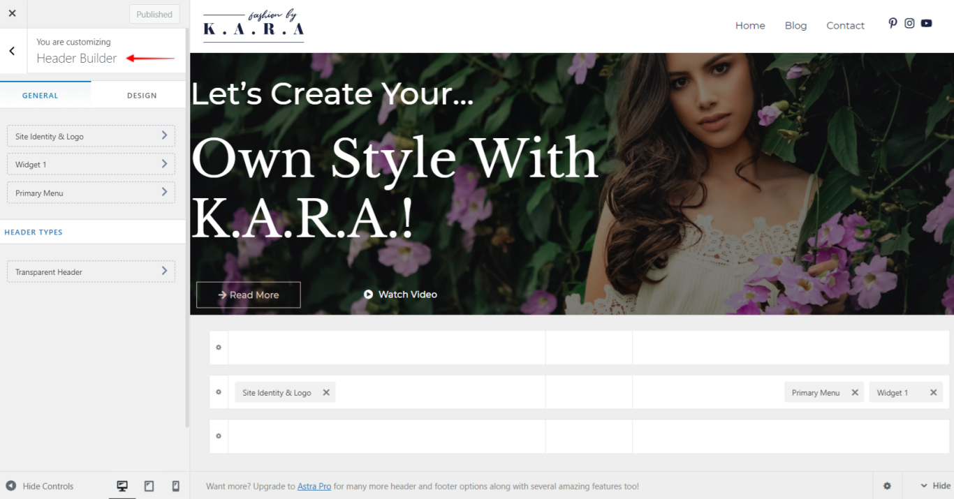
You have full freedom to position elements by just dragging them to any position in the header – as simple as that.
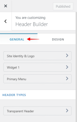
Header Builder – General Tab
General tab is your default view when opening the Header Builder. Here you have an overview of your header setup.
On a left-side menu, all of your active header elements will be listed. Further down, under “Header Types” you can find the transparent header settings.
Rest of the screen is showing a live preview of your header and the position of your elements across header sections.
Transparent Header
Enabling a transparent header will remove the header background color and shift your content to the top of the page underneath the header, creating the transparency effect.
When the transparent header is enabled, it’s advisable to add a hero image (e.g., full-width image or video, sliders, etc.) or use sections without content (e.g., headings or text) positioned on top – this way, you will avoid overlapping the content and the header.
General Tab
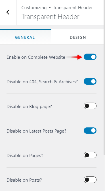
To enable transparency, activate the “Enable on Complete Website” option. This will also open additional options to disable transparent header for a specific page or post types.
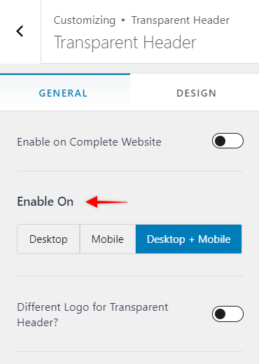
Enable On – choose to enable transparent header on Desktop, Mobile or both (Desktop+Mobile)
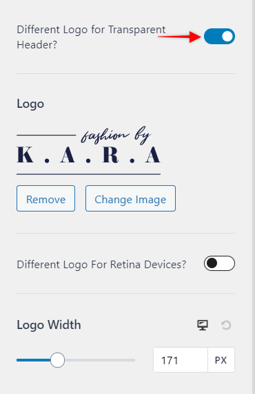
Different Logo for Transparent Header – if your Logo looks good on the standard header, but maybe not so much with a transparent one, you can activate this option and set the different logo to be used for the transparent header.
You can also set the transparent header Logo Width. Depending on the logo you’re using, you might want to add a logo for Retina (higher pixel density) screens which should be at least 2x larger or more. Just click on “Different Logo for Retina Devices” and upload your retina Logo.
Design Tab
Under the Design tab, you’ll find options for styling your Transparent header. You will be able to set the site title, background, menu, submenu, and colors. Also, there are options for setting background overlay and bottom border. The bottom border is by default set to 0px and thus not visible – increasing the border value (1px or more) will make it show on the frontend, and you will also get the option to set the Bottom Border Color.
Keep in mind that these settings are applied only to your Transparent header. If you’re using your regular header on some pages, these settings will not be applied there.
Header Builder – Design
Design tab is used to set your header spacing:
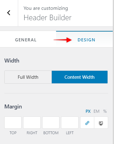
Width sets to total amount of space your header widgets will use:
- Full Width will spread your header widgets from edge to edge of the screen;
- Content Width limits your header widgets to be displayed using your content width – your header background will still be stretching from edge to edge of the screen.
Margin adds space to one or more sides of your header. This will add space to both your header widgets area and background.
Visual Header Builder
The header consists of three separate sections which you can see in the visual header builder area. You can use all three sections to add any element to any position.
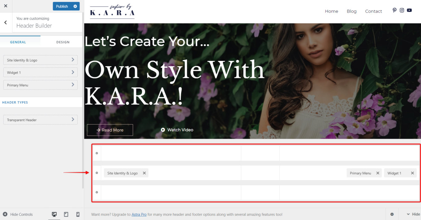
These three sections are:
- Primary Header – this header is the middle section. It is most commonly used for adding your most important elements like Logo, Primary Menu, or Search, Cart, and Account.
- Above Header – this header is the upper section, and it is displayed above Primary Header on your website. It can be used for your secondary elements, like the secondary menu, or elements like social icons, call to action buttons, etc. You can also use HTML code to add for example current discount period, breaking news or some notification for the website visitors.
- Below Header – this header is the lower section, and it is displayed below Primary Header on your website. The use of this header is the same as the Above Header.
The main purpose of Above and Below Headers is to avoid cluttering the Primary Header. They extend the available area for adding all elements and information you need in your Header, as well as to provide a certain level of prioritization.
You can customize each section by clicking on the “cog” icon on the left side of the sections.
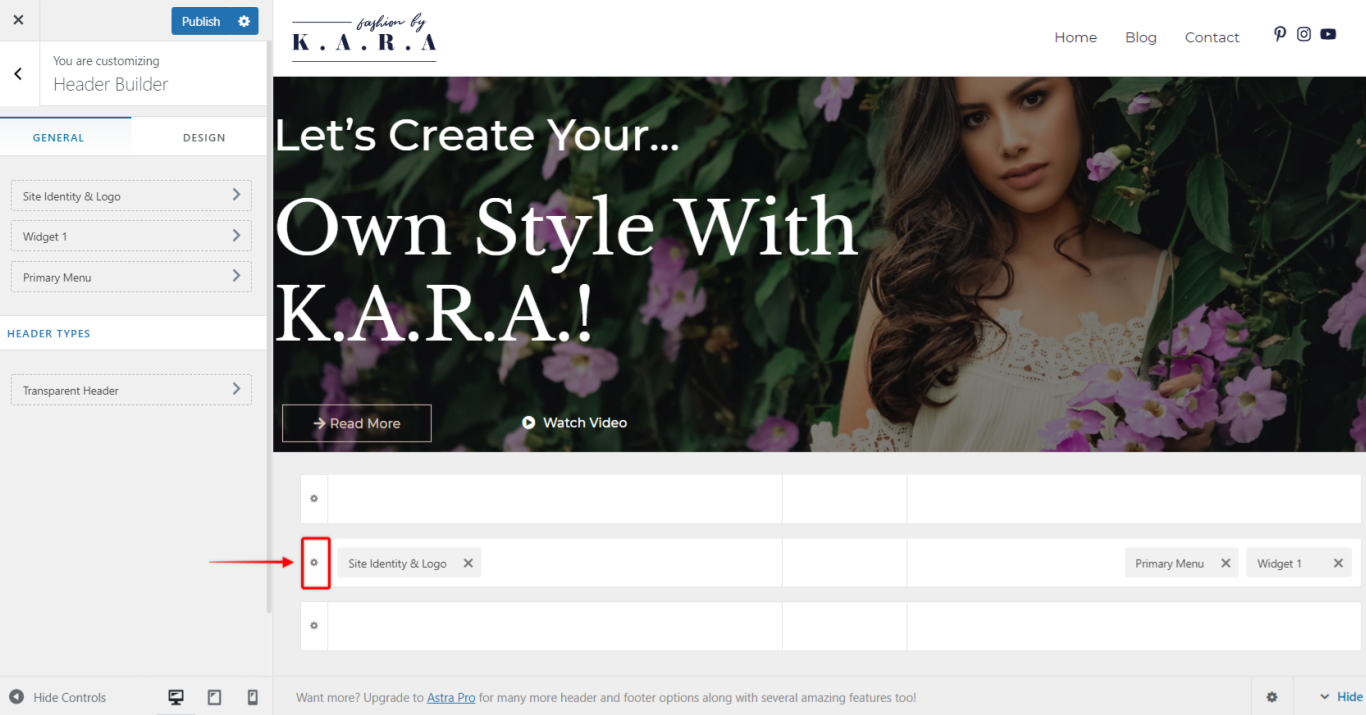
Each section has two tabs:
General
Height – set height of each header separately.
Design
Bottom Border Size (& Color) – if you need to separate your header from another section or website content you can add bottom border by setting the size of your border. Once you set your border size, additional option will appear (Bottom Border Color) for choosing the color of the border;
Background – set the header background color;
Padding – add padding on one or more sides of the header. This will add space between the header section edges and content;
Margin – add margin on one or more sides of the header. This will add space between that header and another website areas (other headers, page/post content, screen edges, etc.);
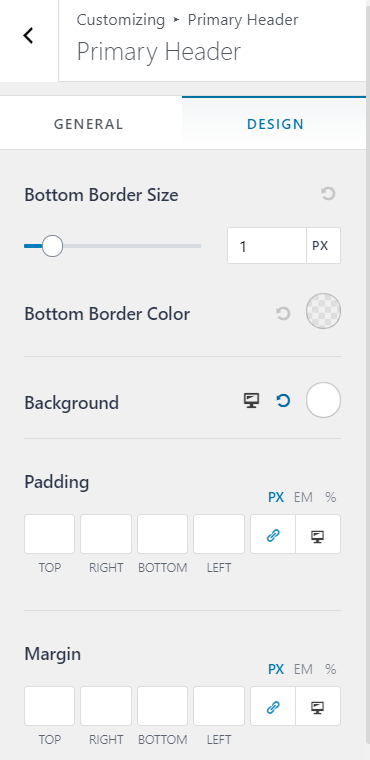
Each header can be customized separately for desktop and mobile and can have different elements added for each view. The position of elements can also be changed.
Off Canvas section
The Off Canvas section is used to edit your tablet/mobile menu. This menu is activated by clicking on the Toggle Button in the mobile menu (also called “hamburger” menu).
To edit this menu, switch to tablet or mobile viewport editing. You can add elements to this menu and set their order the same way you edit other header sections. Clicking on the “cog” icon will open the following tabs:
General
Header Type – set Off Canvas type to Flyout (menu flying in from right or left side of a screen), Full-Screen or Dropdown;
Dropdown Target – choose if you want your sub-menus to open by clicking on the down-arrow icon (Icon) or by clicking to a whole menu item (Link)
Content Alignment – align the Off Canvas section widgets to Left, Centar or Right;
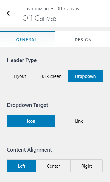
Design
Inner Element Spacing – adding space between the elements;
Background – set the background color.
Header Element
Site Identity & Logo
This is your Site Identity & Logo element (previously named “Logo“). In the General tab, you can add your Logo, set Logo width, and add a Different Logo for Retina devices.
Using this element, next to Logo, you can set your Site Title, Site Tagline, and your Site Icon (favicon). This information is also displayed on the top of your website tab in your browser.
The Design tab is used if you want to add some Margin to this element.
Primary Menu
Here, you will find menu items added to your Primary Menu (Dashboard > Appearance > Menus).
The General tab provides you with several Submenu options: submenu Width, Container Animation (the animation used when expanding a submenu), Item Divider (adds or removes divider between submenu items).
You can also decide if to set your menu items to Stack on Mobile. This is the most common setup for mobile menus – the menu items will be stacked one on top of the other.
The Design tab will allow you to set Menu Hover Style, style your Submenu Container, set the Text and Background Colors, Menu Font, Manu Spacing, and Margin.
Search
Adding this element will add a search function to your header. You can set the Icon Size, Icon Color and Margin.
Social (Header)
You can add your social media icons using this element. You can manage your social media icons using the General tab – add, choose the icon or remove them.
The Design tab holds the options for styling the icons.
Button
This is used for adding a custom button to your header. Add the Text, Link and style (Design tab) the button here.
Secondary Menu
You can add another (secondary) menu to your header if you need it. You can also use this if you wish to split your primary menu into two separate menus – for example, if you want to create a header with a centrally positioned Logo, with your menu items next to it on the left and right sides.
You can customize this menu the same way as the Primary Menu.
HTML
Use this element to add HTML code or shortcodes.
Widget
This is used to add any of the website widgets (Dashboard > Appearance > Widgets) to your header.
Toggle Button
Toggle Button (also known as hamburger icon or button) is used to expand your tablet/mobile menu. Thus, this element is only available on tablet or mobile views.
The General tab will enable you to choose the button Icon and Icon Size, add Menu Label (text next to the icon) if you need it, and the Toggle Button Style.
The styling options are located in the Design tab: Icon Color, Background Color, Border Radius and Margin.
Account
If you have some plugins like LearnDash or WooCommerce active, you can add the user account shortcut using this element.
Cart
This will add a Cart icon (WooCommerce) to your header. Next, set if Cart Title should be displayed as well, or only the cart icon, and whether you want to display a Cart Total too (General tab). You can also style your cart and your cart tray (Design tab).
We don't respond to the article feedback, we use it to improve our support content.
