- What is Astra Pro Add on?
- What Is a Child Theme and How To Install It for Astra?
- How to Activate Astra Pro Addon License?
- How to Get License Key of Astra Pro?
- How to Install Astra Pro Plugin?
- Getting Started with Astra Pro Addon Plugin
- Getting error – The package could not be installed. The theme is missing the style.css stylesheet?
- Do Not See License Activation Form for Astra Pro Addon Plugin?
- How to Install Astra Theme?
- Know More about Astra Beta Versions? How to Download and Use?
- Custom Layouts Overview
- Cannot edit Custom Layouts / Custom Layouts having 404 error?
- Custom Header
- Custom Footer
- Site Builder – Hooks
- Custom 404 Page
- How to Translate Custom Layouts with WPML?
- Display Settings of Custom Layouts in Astra Pro
- Inside Page/Post Content Custom Layouts
- Quick admin bar navigation to edit custom layout & page header
- Astra WooCommerce Mini Cart Shortcode
- WooCommerce Module Overview
- How to Design a Product Catalog Page or Shop Page Using WooCommerce Module in Astra?
- Single Product WooCommerce
- Checkout Page WooCommerce
- Colors & Background options for WooCommerce
- Typography Options for WooCommerce
- How to Add WooCommerce Mini Cart in Header? (Old Astra Header)
- Off-Canvas Sidebar for WooCommerce Shop Page
- Quick View for WooCommerce Products
- How to Disable EDD Inbuilt Styling?
- How to Add Download Archive Pages to the Menu When Using Astra with EDD?
- How to Add EDD Cart in Header? (Old Astra Header)
- How to Display a Mini Cart Anywhere Using Shortcode? (Astra and EDD)
- EDD – Easy Digital Downloads Module Overview
- General – EDD Module Options
- Product Archive – EDD Module Options
- Single Product – EDD Module Options
- Checkout Page – EDD Module Options
- Colors & Background options for EDD
- Fix for – The PCLZIP_ERR_BAD_FORMAT (-10) Error
- Fix for – Parse error: syntax error, unexpected T_FUNCTION
- How to fix Fatal Error / White Screen of Death?
- Fix for- cURL error 51: SSL: no alternative certificate subject name matches target host name ‘websitedemos.net’
- Getting error – The package could not be installed. The theme is missing the style.css stylesheet?
- ‘The preview could not be loaded’ Pop Up with Astra and Elementor
- Troubleshooting Steps ( with Health Check & Troubleshooting plugin )
- How to Deal with Update Issues in Astra Theme and Astra Pro Addon?
- Blog Featured Image Size Not Working / Error in Image Processing Library
- How to Clear Astra’s Cache?
- How To Reset WordPress Installation?
- XMLReader Support Missing – Starter Templates
- cURL Support Missing – Starter Templates
- Required File Permissions Missing – Starter Templates
- Disable Debug Mode – Starter Templates
- Update Required Plugins – Starter Templates
- How to Import A Complete Site With Starter Templates?
- Starter Templates — Basics and FAQs
- How to Import Single Page With Starter Templates?
- Starter Templates with Other Themes
- How to Translate Astra Theme / Plugins in Your Own Language using GlotPress?
- How to Turn Astra Multilingual with WPML?
- How to Translate Custom Layouts with WPML?
- How to Translate Astra Strings with WPML?
- How Translations can be Manually Exported and Uploaded to the Site?
- How to Turn Astra Website Multilingual with Polylang?
- How to Translate Categories, Tags, and Astra Strings with Polylang
- How to Turn Astra Website Multilingual with TranslatePress?
- How to translate the WooCommerce string?
- Astra theme string translation for WooCommerce
- Change Woocommerce Out of Stock Text
- How to Disable Product Quantity (Plus-Minus) Buttons?
- How to Modify/Change the Quick View text?
- Filter to Add Global Button Settings Support for WooCommerce Buttons
- Change the “Shopping Cart” Text for WooCommerce & EDD Mobile Header Cart
- Fix Woocommerce Cart Becoming Transparent With Header Builder
- Restrict Search Results to WooCommerce Products Only
- How To Hide Quantity Number When the Woocommerce Cart Is Empty?
- Remove Astra Customization for WooCommerce
- Remove Woocommerce Product Category Archive Title
- How to Change the Default Astra Strings
- Using Hooks in Astra
- How to Change the “Scroll To Top” Icon in Astra?
- Astra Pro WP CLI Commands
- How to Add Custom PHP Code?
- How to Disable the Loading of Astra’s Default Font File? (Astra.woff)
- Disable Featured Image on Posts, Pages, or Other Post Types
- Change Sidebar Widget Title Heading Tag
- Disable Astra’s Native AMP Functionality
- Disable All Meta Settings of Page/Post by Default
- How to Display “Last Updated” instead of “Published” Date
- How to Change Previous and Next Link Text from a Single Blog Post?
- How to Remove Featured Image Link on Archive Page?
- Filter to Remove Link From Featured Images on Blog Page
- Blog Featured Image Size Not Working / Error in Image Processing Library
- How To Change Navigation Links Text for a Blog Archive?
- How to Display the Post Category as a Related Posts Title?
- Change “Leave A Comment” title tag
- Customizing Social Profile Links for Individual Authors in Single Posts
- How to Change Website Logo Destination URL
- Remove Primary Navigation Menu with Hook
- Change the Astra Header Breakpoint Width
- How to Disable Primary Header?
- Add Title attribute to Header Background Image as a Substitute for Alt Text
- How to Change HTML tag for Site Title and Tagline?
- How to Change the Heading Tag for the Page/Post Titles?
- Change the String “Search Results For”
- Change Placeholder for Search Box (Old Astra Header)
- How to Update Responsive Breakpoints for Tablet+Mobile in Astra?
- Fix Swap Sections Not Working on Mobile (Old Astra Header)
- How to Remove Google Fonts Suggestions in Astra Theme?
- Remove default stretched block layout spacing
- How to Change the Logo on Specific Pages?
- How to remove horizontal & vertical gallery layouts from a single product page?
- Introducing New Filter to Enable/Disable Rank-Math Theme Support
- How to Fix the Line Height Unit being converted to “EM”?
- How to Change WordPress Post labels to Projects
- Managing User Roles and Permissions for the Gutenberg Template Library
- Footer Custom Text Helper Strings
- Does Astra support Beaver Themer Plugin?
- Increasing the PHP Memory Limit of Your Website
- How to Disable Header or Footer for a Landing Page or Post?
- Where Does Astra Primary Color Setting Take Effect?
- How to Adjust the Width of Your Sidebar?
- How to Update the Plugin Manually from WordPress Backend?
- Recommended Settings for Elementor and the Astra Theme
- Recommended Settings for Beaver Builder and the Astra Theme
- Astra Pro WP CLI Commands
- Why Is My Logo Blurry?
- How to Update Responsive Breakpoints for Tablet+Mobile in Astra?
- FAQs – Astra Header/Footer Builder
- Elements in Header/Footer Builder With Astra Theme and Astra Pro
- Add Multiple Elements in Header Footer Builder
- How To Create a Header With Astra Header Builder?
- How To Create a Footer With Astra Footer Builder?
- How To Create Mobile Header With Astra Header Builder?
- FAQs – Astra Header/Footer Builder – Existing Customers
- Clone and Delete Elements in Header Footer Builder
- Global Container – Astra Theme
- Boxed – Container Layout
- Content Boxed – Container Layout
- Full Width / Contained – Container Layout
- How to Set the Full-width/Stretched Container Layout in Astra?
- Global Colors – Astra Theme
- Global Typography – Astra Theme
- Typography Improvement for Astra
- Astra Global Color Palette
- Astra Typography Presets
- Blog Overview
- Blog / Archive
- Single Post
- How to Display “Last Updated” instead of “Published” Date
- Display Related Posts on Single Blog Post
- The Recommended Size for Featured Image Upload
- How to remove an Author’s name from a Single Blog Post?
- How to Remove Astra Post Excerpt from the Post Archive
- Add Last Updated or Published Date to Blog Posts
- Enhanced Blog Experience: Explore What’s New in Astra v4.6.0
- Astra – Customize the submenu
- The blank screen in the Customizer area
- How to use the color palette of the Astra theme
- How to Import / Export Astra Customizer Settings
- How to disable logo cropping
- How to Create a Sticky Sidebar for Your WooCommerce Shop Page
- How to use dynamic customizer from Astra 4.0.0
- How to Change the Typography of the Astra Menu
How to Customize Button in Gutenberg Editor
In this guide, we’ll teach you how to make your buttons in the Gutenberg editor look just the way you want them to.
It’s really easy to change the appearance of your buttons. But if you ever get stuck while trying to customize them, this guide will help you!
We’ll explain how you can do these things without any fuss:
- Change colors of buttons
- Change shapes, sizes of buttons
- Changing padding of your buttons
- Change alignment of buttons
- Change border radius
- Add links to your button
So, let’s start with the basics!
How to Add a Button on a Page/Post
If you’ve used the Gutenberg block editor before, you probably know that you can easily put a button on your post/pages. Just grab the button block from the library and drop it where you need it.
Watch this video to see how to add the button:
Once you’ve added the button, you can make it look the way you want by customizing it.
How to Customize a Button?
You can change the appearance of your buttons in different ways using the options provided in the default block editor.
We’ve explained how you can use these options to make your buttons look different, like changing their colors or the space around them.
Let’s now take a closer look at these options.
Button Styles
We’ve got two main button styles: Fill and Outline.
Fill buttons are solid filled with single color, and outline buttons have a border around the text with a transparent background.
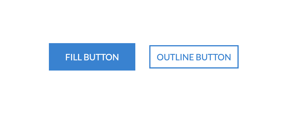
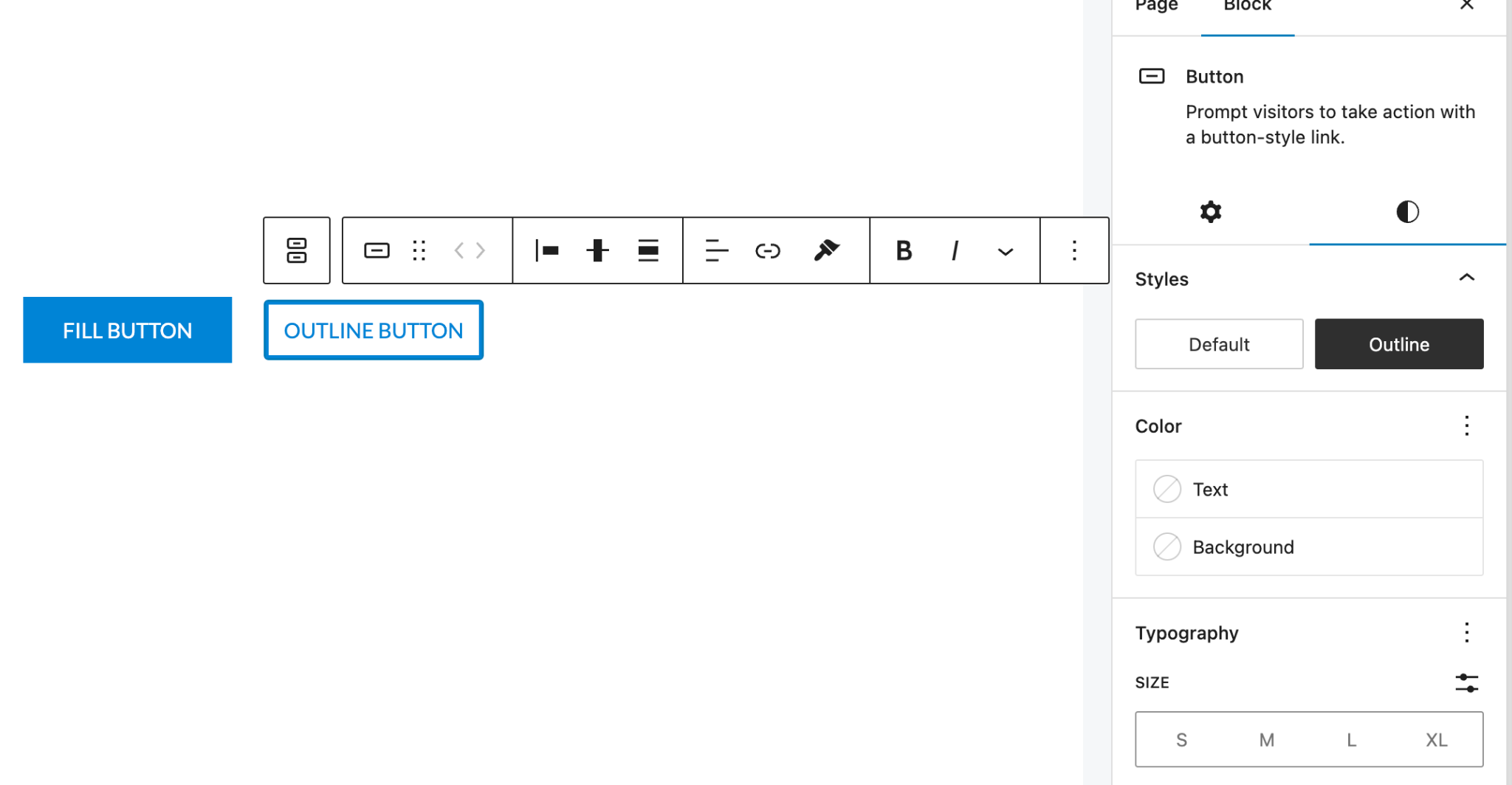
You can select the preferred style by simply choosing the options available on the right sidebar under styles tab.
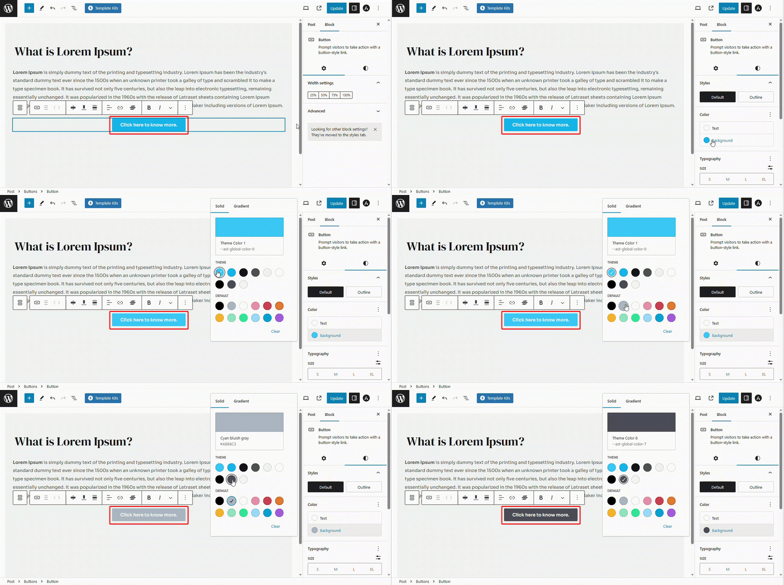
Colors
Gutenberg block editor gives you access to change the color of the text as well as the color of the background of the button easily.
Text Color: To change the color of the text on your button, follow the steps below:
- Navigate to the Styles option.
- Click on the Text Color.
- Click on the color picker and choose the color as per your choice.
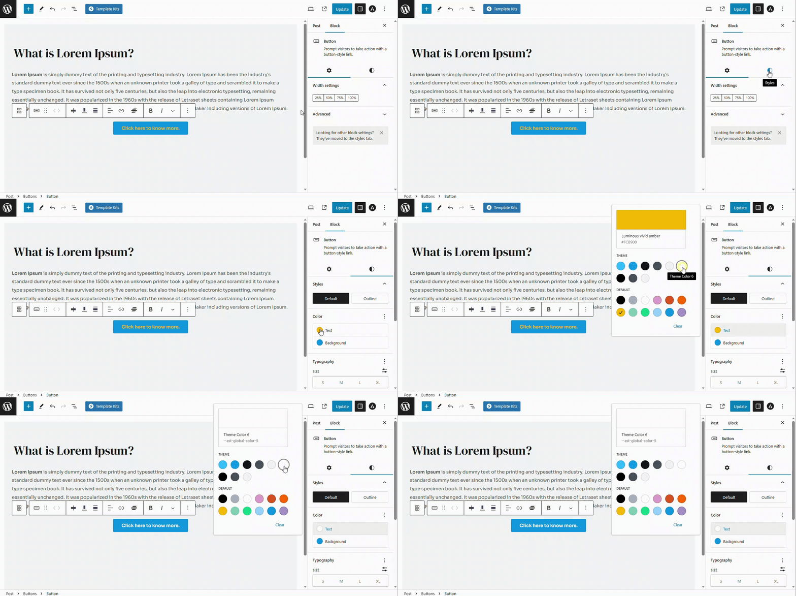
Background color: To change the background color of the button, follow the steps below:
- Navigate to the Styles option.
- Click on the Background Color.
- Click on the color picker and choose the color as per your choice.
Typography
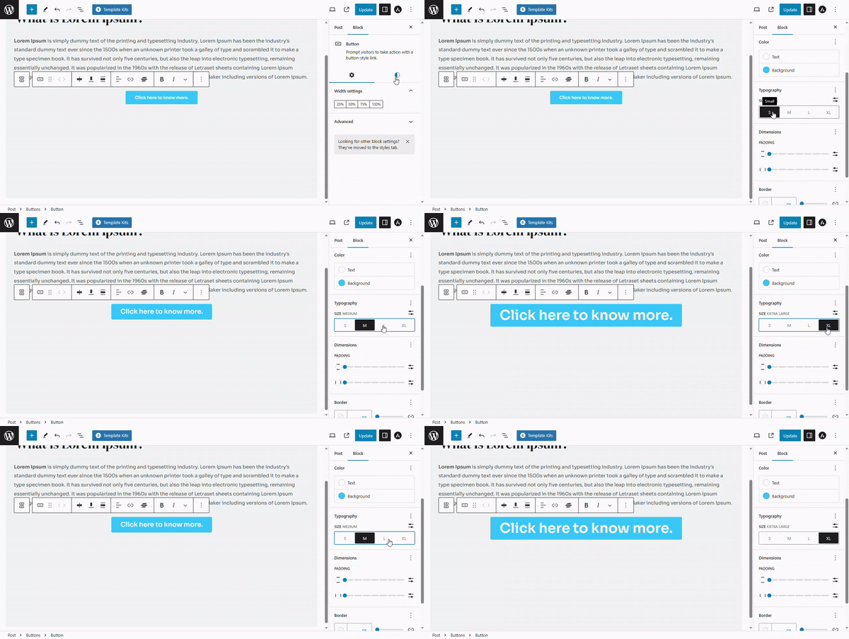
You can easily change the typography of the button text using the gutenberg block editor including the font size, appearance, line height, letter spacing, text decoration and letter case.
Font Size: Font size controls the size of the letters inside the button text. To change the font size, please follow the steps below:
- Navigate to the Styles option.
- Under typography, you will see the available font sizes such as S (small), M(medium),
- L(large) and XL(extra large).
- Click on the size that you would like to choose
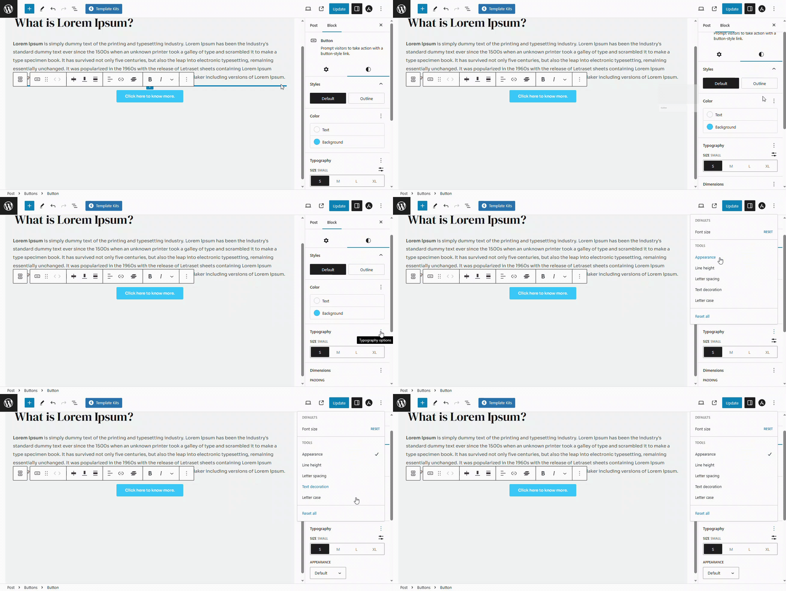
Advanced settings: advanced typography settings include options like Appearance, Line Height, Letter Spacing, Text Decoration and Letter Casing. To access any of these settings, you will need to follow the steps below:
- Navigate to the Styles tab
- Click on the three dots next to Typography option
- Click on the settings that you would like to enable
- A tick mark will appear next to the option indicating that it is enabled
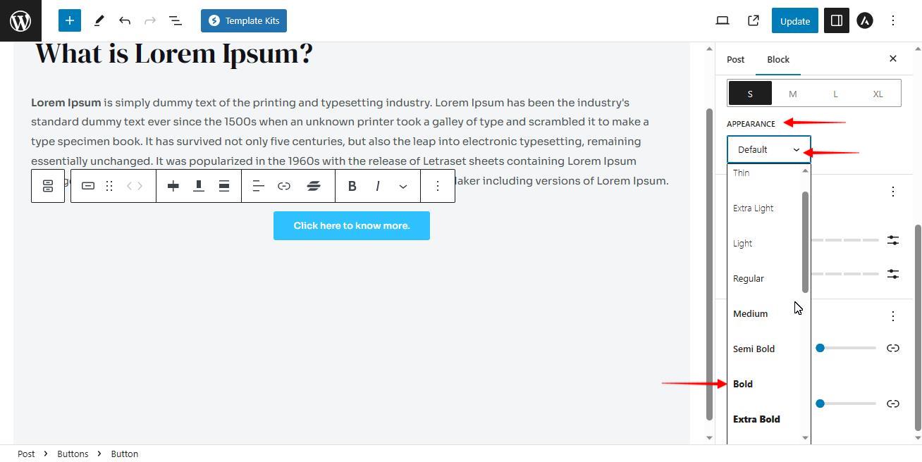
Appearance: Appearance decides whether your button text is extra-bold, bold, semi-bold, regular or thin. This option is normally disabled inside the gutenberg block. Follow the steps below to change the appearance:
- Click on the Default button to open the drop-down
- Select the appearance as per your choice
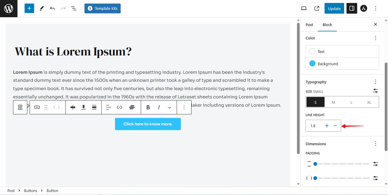
Line Height: It refers to the amount of vertical space between lines of text within a button. This option is also disabled by default.
Once this option is enabled, use the “+” or “-” icons to increase or decrease the line height inside your buttons.
Letter Spacing: Letter spacing is like adjusting how much space there is between each letter in a word or sentence. You can make the letters spread out more or squeeze them closer together.
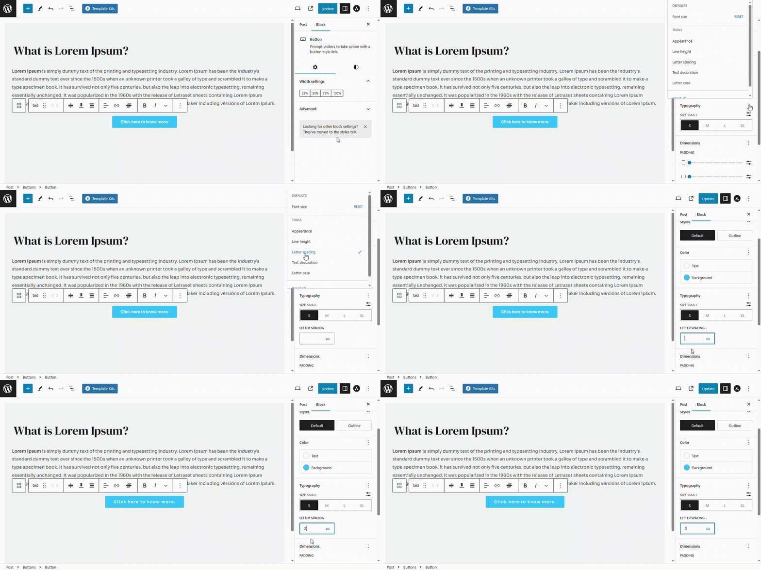
In the Gutenberg block editor, it is counted in Pixels. You can enter the desired amount of spacing in px inside the allocated field..
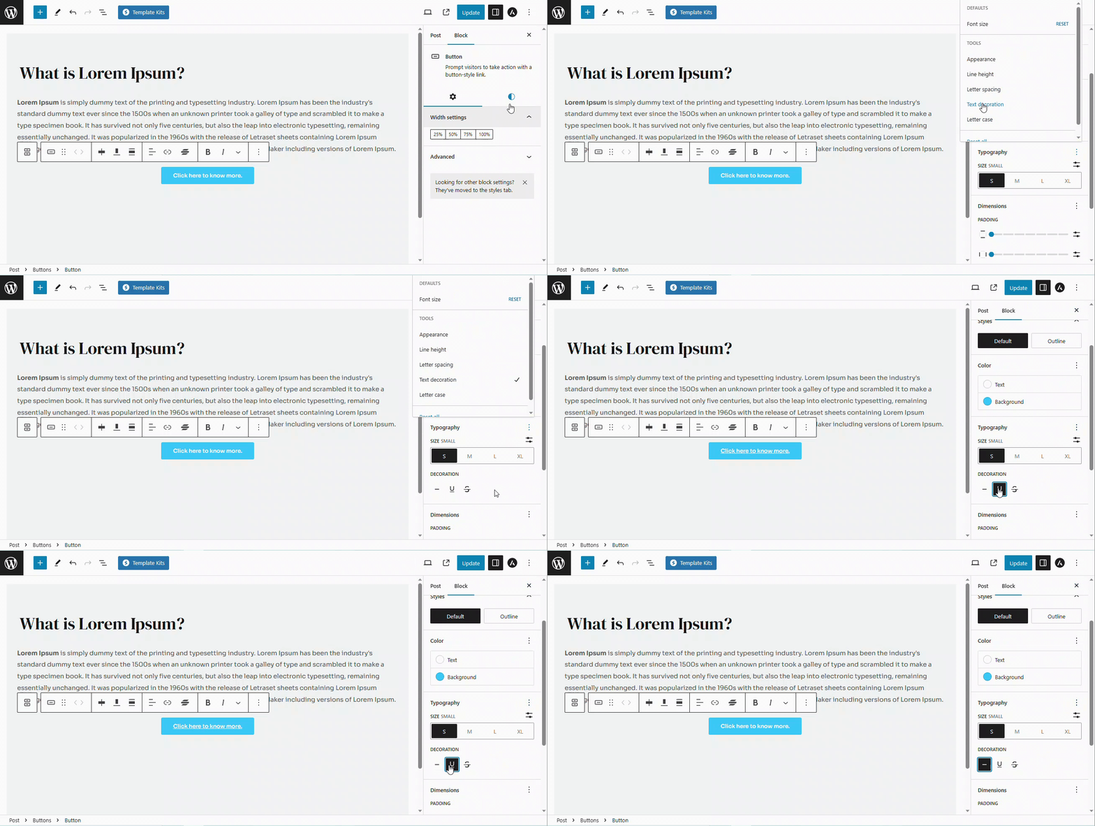
Text Decoration: It adds special effects to your text to make it stand out or look different. This option also needs to be enabled inside the typography section.
It has three different options as mentioned below:
- None: This does not change anything to your button text and is selected by default.
- Underline: This option adds a line under the button text.
- Strike Through: This option adds a line in between the letters of the button text.
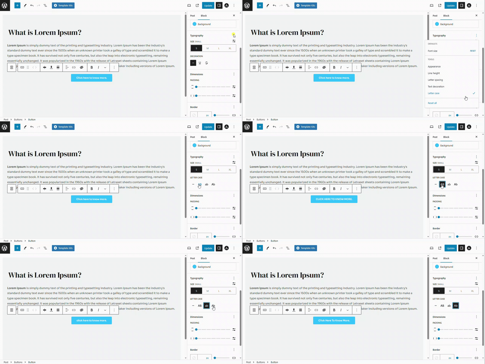
Letter Case: Letter case lets you add variety and change the appearance of your text for different purposes or to match your design. You can make the letters all uppercase (LIKE THIS), all lowercase (like this), or capitalize the first letter of each word (Like This).
Padding
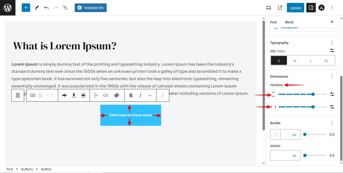
Padding is like giving your content some breathing space. It’s the extra room between the inside of a button, and its outer edges. You can adjust the padding from inside the Gutenberg blocks.
Vertical Padding: Vertical padding adds extra space above and below your button text, like the top and bottom of a button.
Horizontal Padding: Horizontal padding, on the other hand, adds space to the left and right sides of your button text.
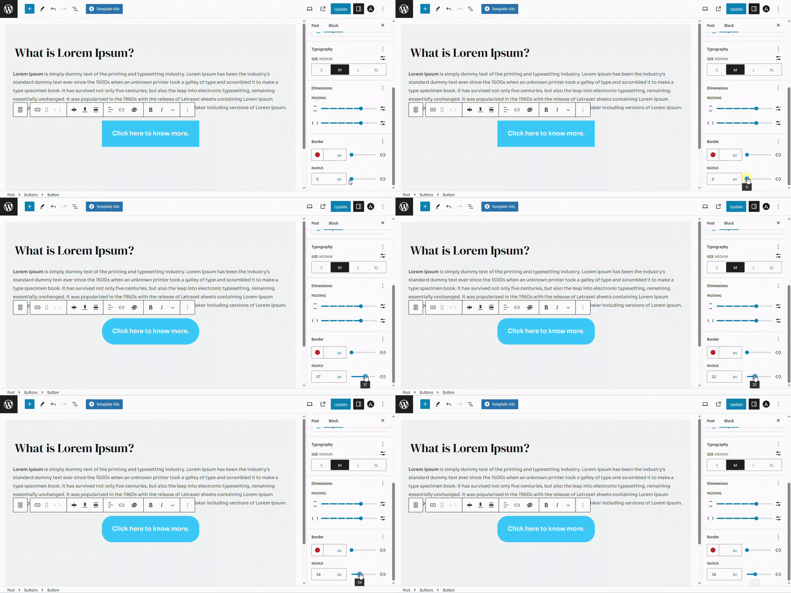
Border Radius
Border radius is like giving your corners a makeover. This option lets you round off the edges of a button. So instead of having sharp corners, you can make them nice and smooth. It’s like turning a square into a more friendly and curvy shape.
How to add a Link to a Button
You can set up your button by adding a link to it so that when the users click on the button, they will be redirected to the link of your choice.
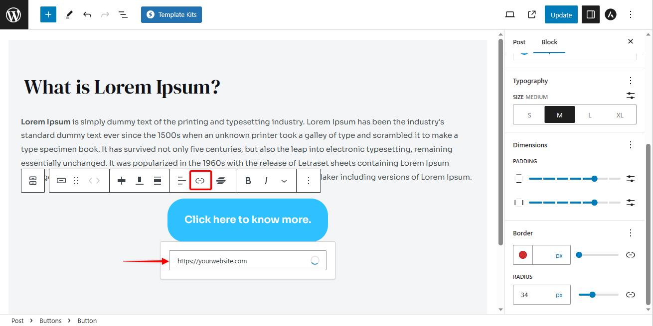
To add a link to a button, please follow these steps:
- Select the button that you would like to add a link to.
- Click on the link option from the toolbar.
- Enter the link that you would like your users to be redirected to.
- Press enter to save.
To know more about adding a link to a button, please read this article.
How to Publish Your Changes
Once you are happy with all the customization of the button, preview it by clicking on the preview tab. You can review it on desktop, tablets and mobile devices.
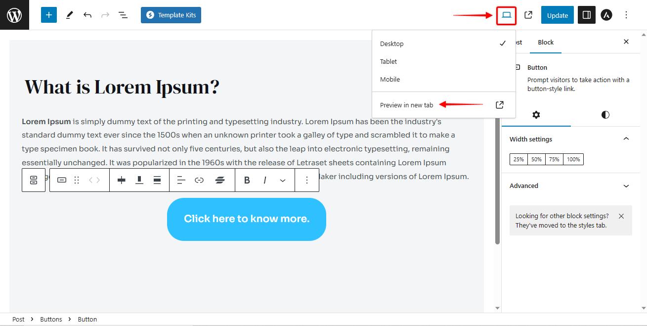
If everything looks right, click on the update/ publish button to publish the button.
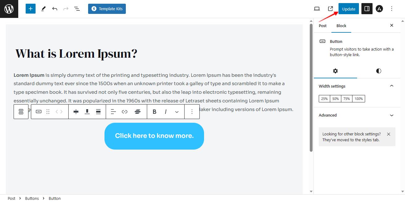
That’s it. Your button is now published.
Customising buttons in the Gutenberg Editor is a breeze. You can change colours, sizes, alignments, and even add links with just a few clicks.
It’s like giving your buttons a personalised touch to match your style.
We don't respond to the article feedback, we use it to improve our support content.
