- Custom Layouts Overview
- Cannot edit Custom Layouts / Custom Layouts having 404 error?
- Custom Header
- Custom Footer
- Site Builder – Hooks
- Custom 404 Page
- How to Translate Custom Layouts with WPML?
- Display Settings of Custom Layouts in Astra Pro
- Inside Page/Post Content Custom Layouts
- Quick admin bar navigation to edit custom layout & page header
- Astra WooCommerce Mini Cart Shortcode
- WooCommerce Module Overview
- How to Design a Product Catalog Page or Shop Page Using WooCommerce Module in Astra?
- Single Product WooCommerce
- Checkout Page WooCommerce
- Colors & Background options for WooCommerce
- Typography Options for WooCommerce
- How to Add WooCommerce Mini Cart in Header? (Old Astra Header)
- Off-Canvas Sidebar for WooCommerce Shop Page
- Quick View for WooCommerce Products
- How to Disable EDD Inbuilt Styling?
- How to Add Download Archive Pages to the Menu When Using Astra with EDD?
- How to Add EDD Cart in Header? (Old Astra Header)
- How to Display a Mini Cart Anywhere Using Shortcode? (Astra and EDD)
- EDD – Easy Digital Downloads Module Overview
- General – EDD Module Options
- Product Archive – EDD Module Options
- Single Product – EDD Module Options
- Checkout Page – EDD Module Options
- Colors & Background options for EDD
- Fix for – The PCLZIP_ERR_BAD_FORMAT (-10) Error
- Fix for – Parse error: syntax error, unexpected T_FUNCTION
- How to fix Fatal Error / White Screen of Death?
- Fix for- cURL error 51: SSL: no alternative certificate subject name matches target host name ‘websitedemos.net’
- Getting error – The package could not be installed. The theme is missing the style.css stylesheet?
- ‘The preview could not be loaded’ Pop Up with Astra and Elementor
- Troubleshooting Steps ( with Health Check & Troubleshooting plugin )
- How to Deal with Update Issues in Astra Theme and Astra Pro Addon?
- Blog Featured Image Size Not Working / Error in Image Processing Library
- How to Clear Astra’s Cache?
- How To Reset WordPress Installation?
- XMLReader Support Missing – Starter Templates
- cURL Support Missing – Starter Templates
- Required File Permissions Missing – Starter Templates
- Disable Debug Mode – Starter Templates
- Update Required Plugins – Starter Templates
- How to Import A Complete Site With Starter Templates?
- Starter Templates — Basics and FAQs
- How to Import Single Page With Starter Templates?
- Starter Templates with Other Themes
- How to Translate Astra Theme / Plugins in Your Own Language using GlotPress?
- How to Turn Astra Multilingual with WPML?
- How to Translate Custom Layouts with WPML?
- How to Translate Astra Strings with WPML?
- How Translations can be Manually Exported and Uploaded to the Site?
- How to Turn Astra Website Multilingual with Polylang?
- How to Translate Categories, Tags, and Astra Strings with Polylang
- How to Turn Astra Website Multilingual with TranslatePress?
- How to translate the WooCommerce string?
- Astra theme string translation for WooCommerce
- How to Change the Default Astra Strings
- Using Hooks in Astra
- How to Change the “Scroll To Top” Icon in Astra?
- Astra Pro WP CLI Commands
- How to Add Custom PHP Code?
- How to Disable the Loading of Astra’s Default Font File? (Astra.woff)
- Disable Featured Image on Posts, Pages, or Other Post Types
- Change Sidebar Widget Title Heading Tag
- Disable Astra’s Native AMP Functionality
- Disable All Meta Settings of Page/Post by Default
- How to Display “Last Updated” instead of “Published” Date
- How to Change Previous and Next Link Text from a Single Blog Post?
- How to Remove Featured Image Link on Archive Page?
- Filter to Remove Link From Featured Images on Blog Page
- Blog Featured Image Size Not Working / Error in Image Processing Library
- How To Change Navigation Links Text for a Blog Archive?
- How to Display the Post Category as a Related Posts Title?
- Change “Leave A Comment” title tag
- Customizing Social Profile Links for Individual Authors in Single Posts
- Change Woocommerce Out of Stock Text
- How to Disable Product Quantity (Plus-Minus) Buttons?
- How to Modify/Change the Quick View text?
- Filter to Add Global Button Settings Support for WooCommerce Buttons
- Change the “Shopping Cart” Text for WooCommerce & EDD Mobile Header Cart
- Fix Woocommerce Cart Becoming Transparent With Header Builder
- Restrict Search Results to WooCommerce Products Only
- How To Hide Quantity Number When the Woocommerce Cart Is Empty?
- Remove Astra Customization for WooCommerce
- Remove Woocommerce Product Category Archive Title
- How to Change Website Logo Destination URL
- Remove Primary Navigation Menu with Hook
- Change the Astra Header Breakpoint Width
- How to Disable Primary Header?
- Add Title attribute to Header Background Image as a Substitute for Alt Text
- How to Change HTML tag for Site Title and Tagline?
- How to Change the Heading Tag for the Page/Post Titles?
- Change the String “Search Results For”
- Change Placeholder for Search Box (Old Astra Header)
- How to Update Responsive Breakpoints for Tablet+Mobile in Astra?
- Fix Swap Sections Not Working on Mobile (Old Astra Header)
- How to Remove Google Fonts Suggestions in Astra Theme?
- Remove default stretched block layout spacing
- How to Change the Logo on Specific Pages?
- How to remove horizontal & vertical gallery layouts from a single product page?
- Introducing New Filter to Enable/Disable Rank-Math Theme Support
- How to Fix the Line Height Unit being converted to “EM”?
- How to Change WordPress Post labels to Projects
- Managing User Roles and Permissions for the Gutenberg Template Library
- Footer Custom Text Helper Strings
- Does Astra support Beaver Themer Plugin?
- Increasing the PHP Memory Limit of Your Website
- How to Disable Header or Footer for a Landing Page or Post?
- Where Does Astra Primary Color Setting Take Effect?
- How to Adjust the Width of Your Sidebar?
- How to Update the Plugin Manually from WordPress Backend?
- Recommended Settings for Elementor and the Astra Theme
- Recommended Settings for Beaver Builder and the Astra Theme
- Astra Pro WP CLI Commands
- Why Is My Logo Blurry?
- How to Update Responsive Breakpoints for Tablet+Mobile in Astra?
- FAQs – Astra Header/Footer Builder
- Elements in Header/Footer Builder With Astra Theme and Astra Pro
- Add Multiple Elements in Header Footer Builder
- How To Create a Header With Astra Header Builder?
- How To Create a Footer With Astra Footer Builder?
- How To Create Mobile Header With Astra Header Builder?
- FAQs – Astra Header/Footer Builder – Existing Customers
- Clone and Delete Elements in Header Footer Builder
- Global Container – Astra Theme
- Boxed – Container Layout
- Content Boxed – Container Layout
- Full Width / Contained – Container Layout
- How to Set the Full-width/Stretched Container Layout in Astra?
- Global Colors – Astra Theme
- Global Typography – Astra Theme
- Typography Improvement for Astra
- Astra Global Color Palette
- Astra Typography Presets
- How to Enable Debugging in WordPress (Debug Mode)
- How To Change Web Stories Position
- How to improve the CLS score with the Astra theme
- How Astra is tuned for performance and is the fastest theme?
- How to use the color palette of the Astra theme
- How to change site background color in Astra
- Narrow Width – Container Layout
- Astra Theme Container Layouts: Revamped Options and Improved User Experience
- Understanding Sidebar Style in Astra Theme: Customizing Your Sidebar’s Look
- Understanding Container Style in Astra Theme: Customizing Your Container’s Look
- How to Use the Astra Button Presets
- Secondary Buttons
- Blog Overview
- Blog / Archive
- Single Post
- How to Display “Last Updated” instead of “Published” Date
- Display Related Posts on Single Blog Post
- The Recommended Size for Featured Image Upload
- How to remove an Author’s name from a Single Blog Post?
- How to Remove Astra Post Excerpt from the Post Archive
- Add Last Updated or Published Date to Blog Posts
- Enhanced Blog Experience: Explore What’s New in Astra v4.6.0
- Astra – Customize the submenu
- The blank screen in the Customizer area
- How to use the color palette of the Astra theme
- How to Import / Export Astra Customizer Settings
- How to disable logo cropping
- How to Create a Sticky Sidebar for Your WooCommerce Shop Page
- How to use dynamic customizer from Astra 4.0.0
- How to Change the Typography of the Astra Menu
- What is Astra Pro Add on?
- What Is a Child Theme and How To Install It for Astra?
- How to Activate Astra Pro Addon License?
- How to Get License Key of Astra Pro?
- How to Install Astra Pro Plugin?
- Getting Started with Astra Pro Addon Plugin
- Getting error – The package could not be installed. The theme is missing the style.css stylesheet?
- Do Not See License Activation Form for Astra Pro Addon Plugin?
- How to Install Astra Theme?
- Know More about Astra Beta Versions? How to Download and Use?
How to use the color palette of the Astra theme
Introduction
Color palettes inside the Astra theme are not just a combination of a few colors. You can change the look and feel of the entire website with just a few clicks using the color palettes. In this document, we will explain how to properly use the color palettes so that you get the maximum out of this amazing feature.
What are the color palettes?
Color palettes are the combination of the colors that you can use to change the way your website looks. Each palette is customizable to match the theme and the logo color of your website. There are 9 colors which will be added by default to each of the color palettes. You can simply edit them and add the colors as per your requirement. By default, the color palette one is selected for your website and you can change the active palette as well as per your requirement.

Note:
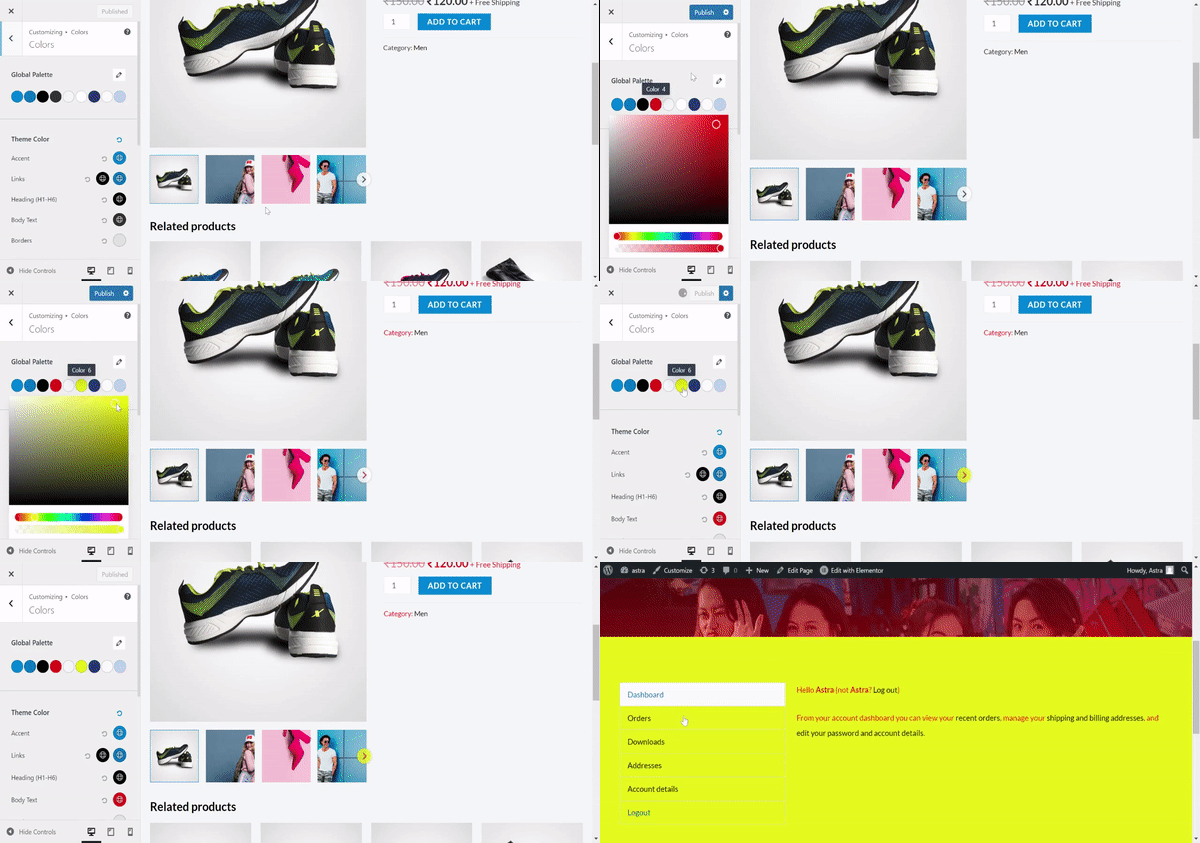
Since Astra 3.9.0, we have been using global colors on multiple instances. Color 4 and Color 6 from the Global Palette change the arrow color and arrow background color on the slider button in the product gallery. And color 6 – It also affects the background colors in the my-account section. Have a glance at the attached video for a better understanding,
Decoding Color Palettes
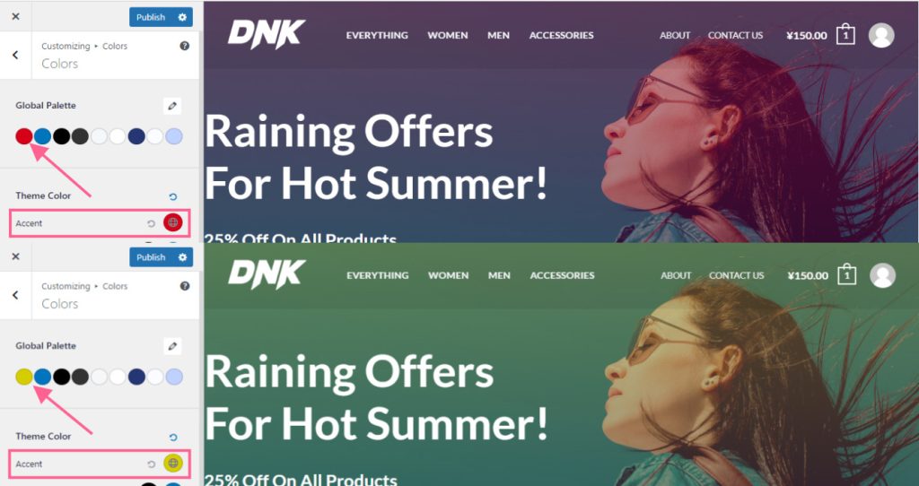
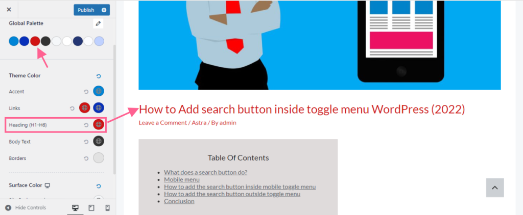
Accent: This is the first color of the palette. It determines the background light color of your website. You can change the color as per your requirement. Just click on the first color of the palette and it will open the color selector. Select the color of your choice.
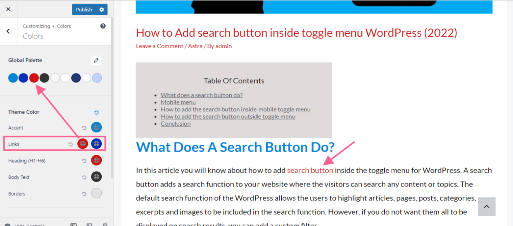
Link Normal color: The third color on the palette is by default set as the link color. You can change it either by clicking on the color palette or the link color directly.
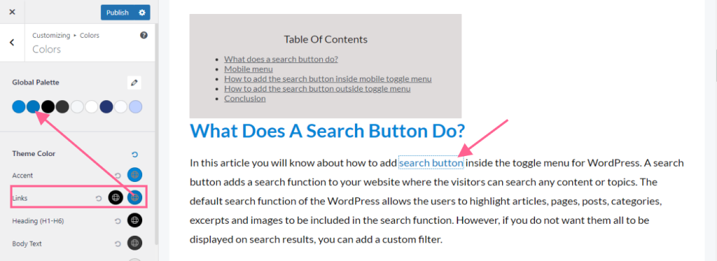
Link Hover Color: The second color on the palette is by default set as a link hover color. You can change the link hover color directly by clicking on the second color on the color palette.
Heading Color: .The third color is also set by default as the heading color unless otherwise applied on the individual pages.
How to create the color palette
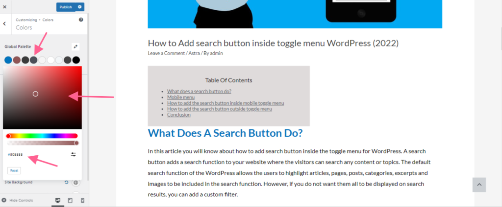
By default, there are three different color palettes available within the Astra theme. You can navigate to Appearance>customize>Global>colors to access them. To edit the colors on the color palettes, simply click on any of the colors and which will bring up the color selectors. Choose the colors as per your preference by clicking on the colors of your choice. You can also copy the color codes and paste them on the color code section in order to choose the colors of your choice.
How to change the color palettes
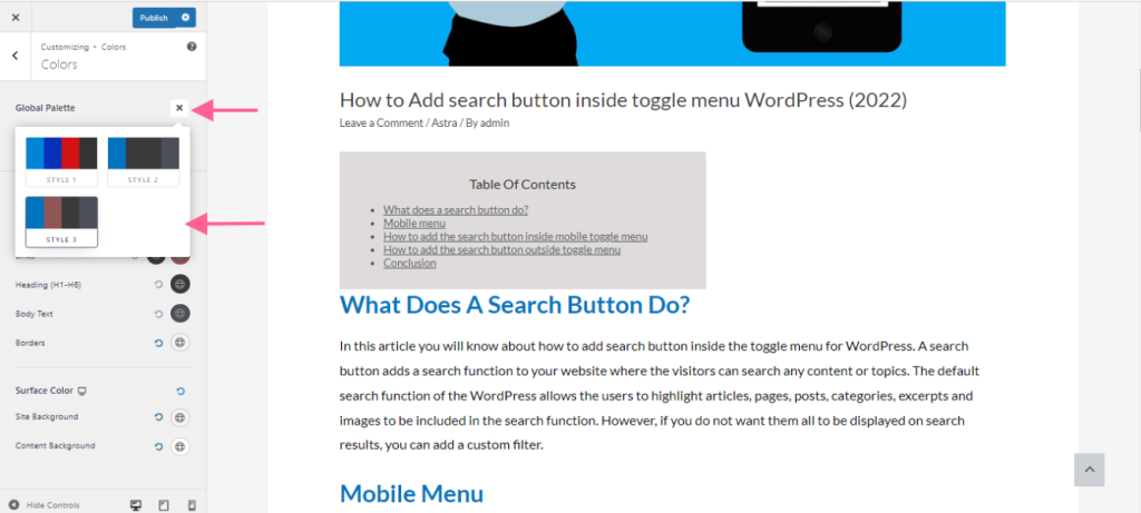
You can simply click on the pencil icon next to the Global palettes and you will get the option to choose the three available color palettes. This feature will help you change the entire look of the site just by simply changing the color palettes.
We don't respond to the article feedback, we use it to improve our support content.
