- How to Translate Astra Theme / Plugins in Your Own Language using GlotPress?
- How to Turn Astra Multilingual with WPML?
- How to Translate Custom Layouts with WPML?
- How to Translate Astra Strings with WPML?
- How Translations can be Manually Exported and Uploaded to the Site?
- How to Turn Astra Website Multilingual with Polylang?
- How to Translate Categories, Tags, and Astra Strings with Polylang
- How to Turn Astra Website Multilingual with TranslatePress?
- How to translate the WooCommerce string?
- Astra theme string translation for WooCommerce
- How to Change the Default Astra Strings
- Using Hooks in Astra
- How to Change the “Scroll To Top” Icon in Astra?
- Astra Pro WP CLI Commands
- How to Add Custom PHP Code?
- How to Disable the Loading of Astra’s Default Font File? (Astra.woff)
- Disable Featured Image on Posts, Pages, or Other Post Types
- Change Sidebar Widget Title Heading Tag
- Disable Astra’s Native AMP Functionality
- Disable All Meta Settings of Page/Post by Default
- How to Display “Last Updated” instead of “Published” Date
- How to Change Previous and Next Link Text from a Single Blog Post?
- How to Remove Featured Image Link on Archive Page?
- Filter to Remove Link From Featured Images on Blog Page
- Blog Featured Image Size Not Working / Error in Image Processing Library
- How To Change Navigation Links Text for a Blog Archive?
- How to Display the Post Category as a Related Posts Title?
- Change “Leave A Comment” title tag
- Customizing Social Profile Links for Individual Authors in Single Posts
- Change Woocommerce Out of Stock Text
- How to Disable Product Quantity (Plus-Minus) Buttons?
- How to Modify/Change the Quick View text?
- Filter to Add Global Button Settings Support for WooCommerce Buttons
- Change the “Shopping Cart” Text for WooCommerce & EDD Mobile Header Cart
- Fix Woocommerce Cart Becoming Transparent With Header Builder
- Restrict Search Results to WooCommerce Products Only
- How To Hide Quantity Number When the Woocommerce Cart Is Empty?
- Remove Astra Customization for WooCommerce
- Remove Woocommerce Product Category Archive Title
- How to Change Website Logo Destination URL
- Remove Primary Navigation Menu with Hook
- Change the Astra Header Breakpoint Width
- How to Disable Primary Header?
- Add Title attribute to Header Background Image as a Substitute for Alt Text
- How to Change HTML tag for Site Title and Tagline?
- How to Change the Heading Tag for the Page/Post Titles?
- Change the String “Search Results For”
- Change Placeholder for Search Box (Old Astra Header)
- How to Update Responsive Breakpoints for Tablet+Mobile in Astra?
- Fix Swap Sections Not Working on Mobile (Old Astra Header)
- How to Remove Google Fonts Suggestions in Astra Theme?
- Remove default stretched block layout spacing
- How to Change the Logo on Specific Pages?
- How to remove horizontal & vertical gallery layouts from a single product page?
- Introducing New Filter to Enable/Disable Rank-Math Theme Support
- How to Fix the Line Height Unit being converted to “EM”?
- How to Change WordPress Post labels to Projects
- Managing User Roles and Permissions for the Gutenberg Template Library
- Footer Custom Text Helper Strings
- Does Astra support Beaver Themer Plugin?
- Increasing the PHP Memory Limit of Your Website
- How to Disable Header or Footer for a Landing Page or Post?
- Where Does Astra Primary Color Setting Take Effect?
- How to Adjust the Width of Your Sidebar?
- How to Update the Plugin Manually from WordPress Backend?
- Recommended Settings for Elementor and the Astra Theme
- Recommended Settings for Beaver Builder and the Astra Theme
- Astra Pro WP CLI Commands
- Why Is My Logo Blurry?
- How to Update Responsive Breakpoints for Tablet+Mobile in Astra?
- FAQs – Astra Header/Footer Builder
- Elements in Header/Footer Builder With Astra Theme and Astra Pro
- Add Multiple Elements in Header Footer Builder
- How To Create a Header With Astra Header Builder?
- How To Create a Footer With Astra Footer Builder?
- How To Create Mobile Header With Astra Header Builder?
- FAQs – Astra Header/Footer Builder – Existing Customers
- Clone and Delete Elements in Header Footer Builder
- Revamped Astra’s Customizer
- Using Language Switcher Element with WPML
- Toggle Button for Desktop – Header Builder Element
- Manage Your Site Identity With Astra’s Header Builder
- How To Create a Header With a Centrally Positioned Logo With Astra?
- How To Fix Right Margin for the Footer Widget Element
- Creating Your Header and Footer With Astra or Elementor?
- Transparent Header for HFB
- How to Create a Mobile Menu
- How to design Footer Background in Astra
- How to Highlight the active menu item
- Sticky Header Background Color
- How to Activate Live Search
- How to Use WhatsApp Social Icon Effectively
- Global Container – Astra Theme
- Boxed – Container Layout
- Content Boxed – Container Layout
- Full Width / Contained – Container Layout
- How to Set the Full-width/Stretched Container Layout in Astra?
- Global Colors – Astra Theme
- Global Typography – Astra Theme
- Typography Improvement for Astra
- Astra Global Color Palette
- Astra Typography Presets
- Blog Overview
- Blog / Archive
- Single Post
- How to Display “Last Updated” instead of “Published” Date
- Display Related Posts on Single Blog Post
- The Recommended Size for Featured Image Upload
- How to remove an Author’s name from a Single Blog Post?
- How to Remove Astra Post Excerpt from the Post Archive
- Add Last Updated or Published Date to Blog Posts
- Enhanced Blog Experience: Explore What’s New in Astra v4.6.0
- Astra – Customize the submenu
- The blank screen in the Customizer area
- How to use the color palette of the Astra theme
- How to Import / Export Astra Customizer Settings
- How to disable logo cropping
- How to Create a Sticky Sidebar for Your WooCommerce Shop Page
- How to use dynamic customizer from Astra 4.0.0
- How to Change the Typography of the Astra Menu
- What is Astra Pro Add on?
- What Is a Child Theme and How To Install It for Astra?
- How to Activate Astra Pro Addon License?
- How to Get License Key of Astra Pro?
- How to Install Astra Pro Plugin?
- Getting Started with Astra Pro Addon Plugin
- Getting error – The package could not be installed. The theme is missing the style.css stylesheet?
- Do Not See License Activation Form for Astra Pro Addon Plugin?
- How to Install Astra Theme?
- Know More about Astra Beta Versions? How to Download and Use?
- Custom Layouts Overview
- Cannot edit Custom Layouts / Custom Layouts having 404 error?
- Custom Header
- Custom Footer
- Site Builder – Hooks
- Custom 404 Page
- How to Translate Custom Layouts with WPML?
- Display Settings of Custom Layouts in Astra Pro
- Inside Page/Post Content Custom Layouts
- Quick admin bar navigation to edit custom layout & page header
- Astra WooCommerce Mini Cart Shortcode
- WooCommerce Module Overview
- How to Design a Product Catalog Page or Shop Page Using WooCommerce Module in Astra?
- Single Product WooCommerce
- Checkout Page WooCommerce
- Colors & Background options for WooCommerce
- Typography Options for WooCommerce
- How to Add WooCommerce Mini Cart in Header? (Old Astra Header)
- Off-Canvas Sidebar for WooCommerce Shop Page
- Quick View for WooCommerce Products
- How to Disable EDD Inbuilt Styling?
- How to Add Download Archive Pages to the Menu When Using Astra with EDD?
- How to Add EDD Cart in Header? (Old Astra Header)
- How to Display a Mini Cart Anywhere Using Shortcode? (Astra and EDD)
- EDD – Easy Digital Downloads Module Overview
- General – EDD Module Options
- Product Archive – EDD Module Options
- Single Product – EDD Module Options
- Checkout Page – EDD Module Options
- Colors & Background options for EDD
- Fix for – The PCLZIP_ERR_BAD_FORMAT (-10) Error
- Fix for – Parse error: syntax error, unexpected T_FUNCTION
- How to fix Fatal Error / White Screen of Death?
- Fix for- cURL error 51: SSL: no alternative certificate subject name matches target host name ‘websitedemos.net’
- Getting error – The package could not be installed. The theme is missing the style.css stylesheet?
- ‘The preview could not be loaded’ Pop Up with Astra and Elementor
- Troubleshooting Steps ( with Health Check & Troubleshooting plugin )
- How to Deal with Update Issues in Astra Theme and Astra Pro Addon?
- Blog Featured Image Size Not Working / Error in Image Processing Library
- How to Clear Astra’s Cache?
- How To Reset WordPress Installation?
- XMLReader Support Missing – Starter Templates
- cURL Support Missing – Starter Templates
- Required File Permissions Missing – Starter Templates
- Disable Debug Mode – Starter Templates
- Update Required Plugins – Starter Templates
- How to Import A Complete Site With Starter Templates?
- Starter Templates — Basics and FAQs
- How to Import Single Page With Starter Templates?
- Starter Templates with Other Themes
Manage Your Site Identity With Astra’s Header Builder
Your Logo and other Site Identity options are directly related to the presentation of your brand. As they are part of your header, these are visible on all pages and posts thus they help users always be aware of the website and brand they are interacting with.
The Astra Theme comes with a drag & drop Header Footer Builder. With Header Builder, you can manage your site identity using the Site Identity & Logo element. This document will show you how to easily set your Logo and other Site Identity elements. These include:
- Logo
- Retina Logo
- Logo for mobile devices
- Site Title
- Site Tagline
- Site Icon (Favicon)
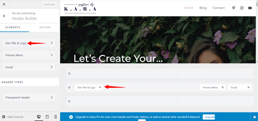
You can find the Header Builder by navigating to Appearance > Customize > Header Builder. To access the element settings just click on the element in the elements list on the left, or in the visual header builder under the preview.
Logo
You can add your Logo under the General tab. To add or change your logo, you can follow these steps:
Step 1 – Click on the Logo area and upload a file or select a logo from your Media Library. You can add logos as JPG, PNG, and SVG.
Step 2 – Though this step is optional, enabling a Different Logo For Retina Devices will ensure your logos look great on devices with retina screens. It’s advisable to upload at least two times larger so your logos won’t be blurred on high-definition screens. You can find out more about the retina logo in this article. If you decide not to use this option, your website will show your primary logo (from Step 1) on retina screens too.

Step 3 – Once your logo is added, you can choose the Logo Width. This will set the size of your logo, as the height will be automatically calculated based on the width. You can also set different logo widths for desktop, tablet, and mobile by clicking the responsive editing icon to switch between these screens.
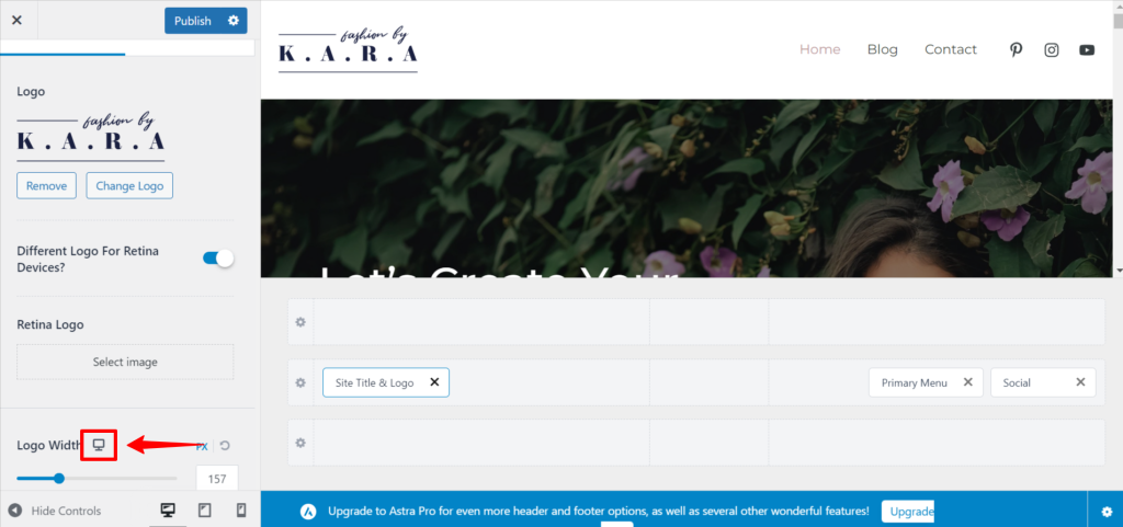
Step 4 – If your design requires a different logo on mobile devices, you can switch to mobile editing and enable Different Logo For Mobile Devices to add a different logo only for mobile devices. Keep in mind that the mobile logo you set will be used for both tablets and mobile phones. You can find more about creating a mobile header in this article.
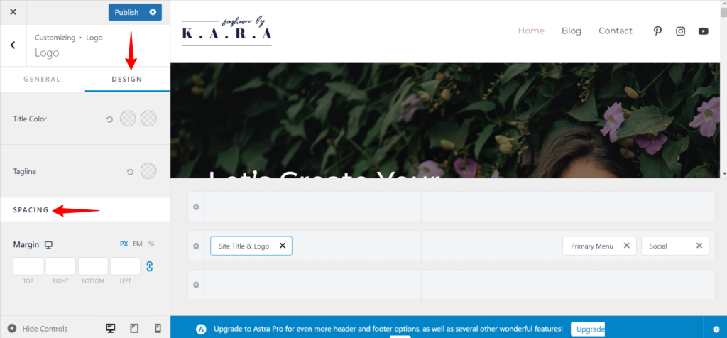
Step 5 – You can switch to the Design tab of the element and set Logo margins.
Note:
If you enable the Transparent header, you will have a Different Logo for Transparent Logo option, enabling setting a different Logo, Retina Logo, and Logo Width applied only to the Transparent header. This option is available at Appearance > Customize > Header Builder > Transparent Header > General tab.
Site Title and Tagline
Site Title is a name you set for the website, while the Tagline is the short one-line description.
Step 1 – You can make these visible beneath your logo by enabling their respective options within the General tab of the Site Identity & Logo element. You can enable these separately for desktop, tablet, and mobile.
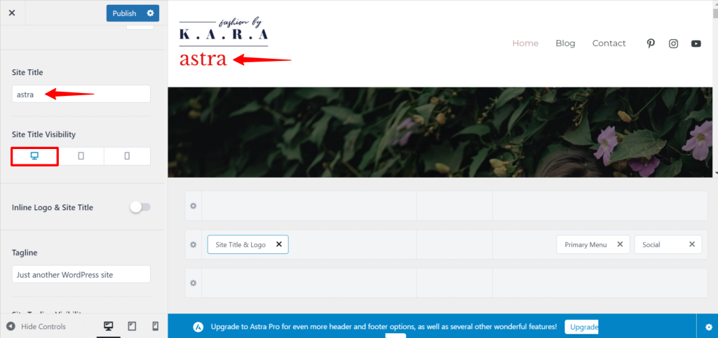
Step 2 – Usually, site title and tagline are added when creating a new website at Dashboard > Settings > General. If you want to modify these, you can do it directly in the element settings without leaving your Customizer.
Step 3 – Also, if you would like to position your site title and tagline on the right side of your Logo, you just need to enable the Inline Logo & Site Title option.
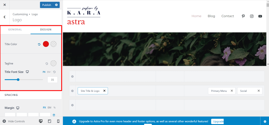
Step 4 – If you switch to the Design tab of the element, you will find the options for changing the Color and Font Size of the Site Title and Tagline.
Note:
If you enable the Transparent header, you will have separate options for setting different Title Color used only for the Transparent header. This option is available at Appearance > Customize > Header Builder > Transparent Header > Design tab.
Site Icon (Favicon)
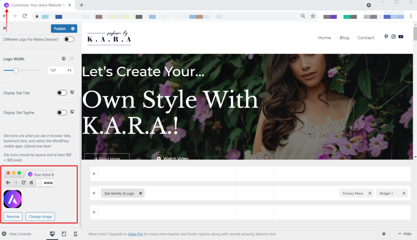
This is a small image icon that can be seen in the tab of a web browser, bookmark bars, and WordPress mobile apps. You can set it with the site icon option. The recommended size for a favicon is 512 pixels. Learn more about Site Icon here.
We don't respond to the article feedback, we use it to improve our support content.
