eBooks are a great form of content and are digital alternatives to traditional paperback or hardback books.
They are often used to boost lead generation and raise brand awareness by allowing visitors to download them from the opt-in section of a website.
Whether you want to sell eBooks or use them for marketing, an effective landing page can help promote and convert.
- The average landing page conversion rate across all industries is 9.7%.
- Addressing buyer fears on landing pages can increase conversion rates by 80%.
- 48% of top landing pages ranked in Google Maps and organic search query results.
- Landing pages have the highest conversion rate (23%).
(Source)
We’re going to show you how to create a landing page for an eBook step by step. We’ll walk you through everything from installing WordPress to launching your page.
We have built hundreds of landing pages for all kinds of businesses, so you’re in safe hands!
What Is an eBook Landing Page?
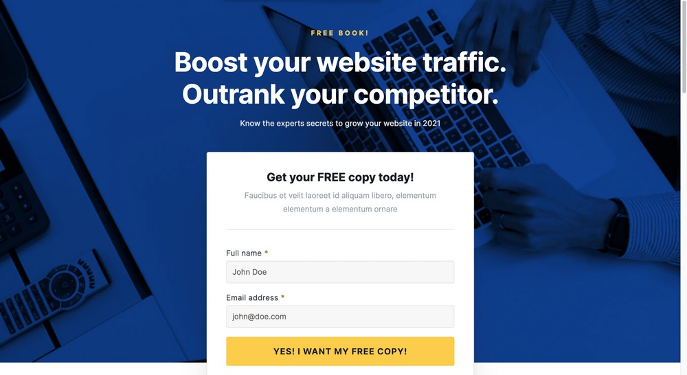
An eBook landing page is a single web page that contains all the information readers need to learn about a book or an offer.
eBook sales landing pages will typically include title, author, synopsis, and links to purchase or download it.
Marketing landing pages will promote the book but also the value of the offer, usually a purchase or exchange of email address for a free book.
They are incredibly effective as they use minimal distractions to funnel the reader towards your desired outcome. Whether that’s a sale or an email address in return for a free book.
Landing pages are also useful as standalone pages for individual products or services.
For example, if you write academic books but want to try your hand at romance novels, promoting your novels on a dedicated landing page keeps both genres separate.
Three Examples of eBook Landing Pages That Convert
No matter whether your eBook is free, paid, long or short, it deserves to have a dedicated landing page.
Before you create your page, let’s take a look at some sample landing pages used by some well known companies.
1. Hubspot
HubSpot’s eBook landing page boasts an impressive example of attractive visuals to captivate readers and encourage them to take action.
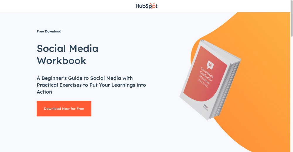
What We Liked About the Page
- It has a striking call to action without the opt-in form. Rather, they have concealed it using a modal popup that asks for the name and email.
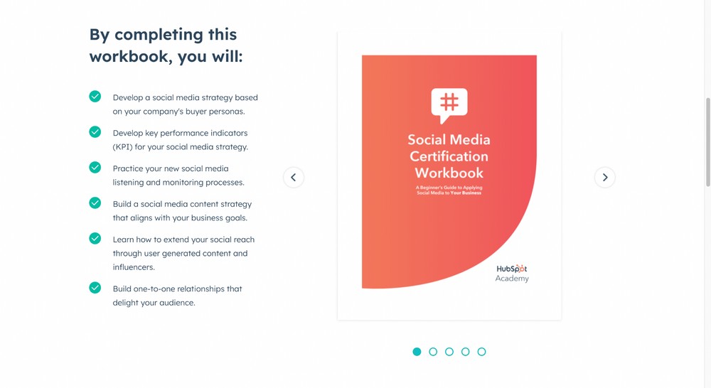
- A dedicated section that talks about the description and objective of the eBook.
- Includes some relevant FAQs.
What Could Be Improved?
They could showcase some of the social proof to help build more trust.
2. Kinsta
The next example is from another great company called Kinsta. Here’s an example of one of their eBook landing pages:
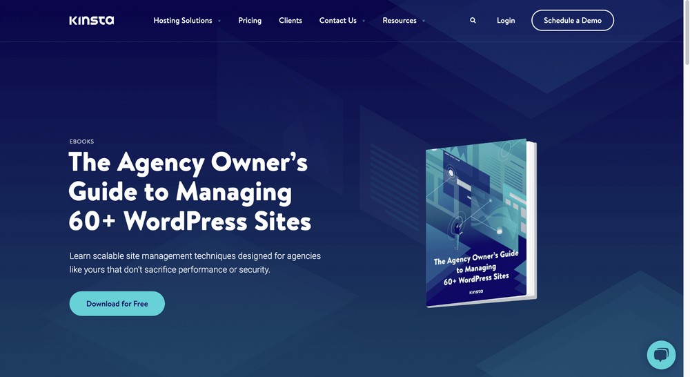
What We Liked About the Page
- They have used an amazing design and a great animation. For example, if you hover over the book, it is rendered in 3D mode, which is cool. (Even we are hovering over it just to play around with it 🙂) It’s a great way to reduce bounce rate.
- They have written the book’s teaser with engaging copy.
What Could Be Improved?
- Omitting the navigation bar to reduce distraction.
- Including an opt-in form to collect leads. We noticed there was no opt-in form. So we could download it without inputting any details.
- Showcasing social proof.
3. Search Engine Journal
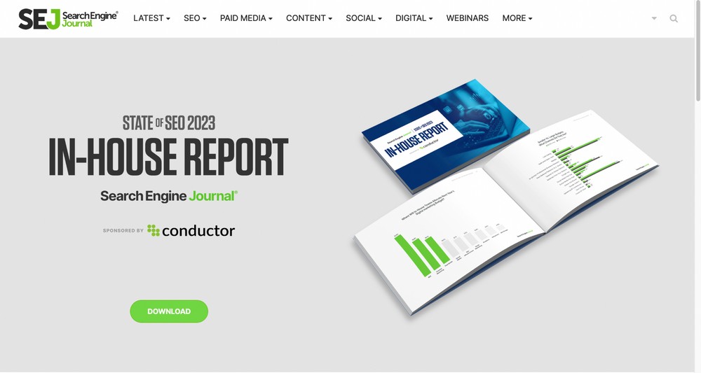
The final example is from the popular online publication, Search Engine Journal.
What We Liked About the Page
- It offers an appealing design, clear call to action buttons and a visually striking layout.
- The headline immediately draws visitors in, while the copy highlights the book’s benefits and demonstrates why it’s worth downloading.
- While showcasing the eBook’s images, they demonstrate the bar diagrams and other statistical figures, making it a lucrative resource for visitors.
What Could Be Improved?
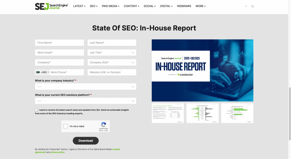
The form is not optimized as they collect too much user data, which might hurt the conversion rate.
How To Create an eBook Landing Page for Free
Rather than complicating things by constantly talking about the two main uses for an eBook landing page, let’s concentrate on one use case.
Let’s use the marketing eBook download option as it’s the most common requirement. It won’t take much to tweak the page for selling instead.
If you’re reading about building a landing page, you may already have a website in place. If so, skip the installation part and move directly to Step 2.
If you’re at the very beginning of your journey, read on.
- Step 1: Install WordPress
- Step 2: Install CartFlows
- Step 3: Import an eBook Landing Page Template
- Step 4: Publish Your Landing Page
- Step 5: Add a Payment Gateway – Optional
We’ll assume your eBook is published and ready for download.
Step 1: Install WordPress
Our first task is to install WordPress. It’s a free and open-source content management system that will enable our landing page to work.
Some web hosts install WordPress automatically while others use one-click installers.
If you want to install it yourself, read how to install WordPress.
Step 2: Install CartFlows
CartFlows is a sales funnel builder that also ships with templates and all the features you need to increase conversions.
You could use a dedicated landing page builder, but they won’t have the sales funnels tool to help conversions. That’s why we recommend CartFlows.
It integrates with WooCommerce and SureCart to make building high performance landing pages simple.
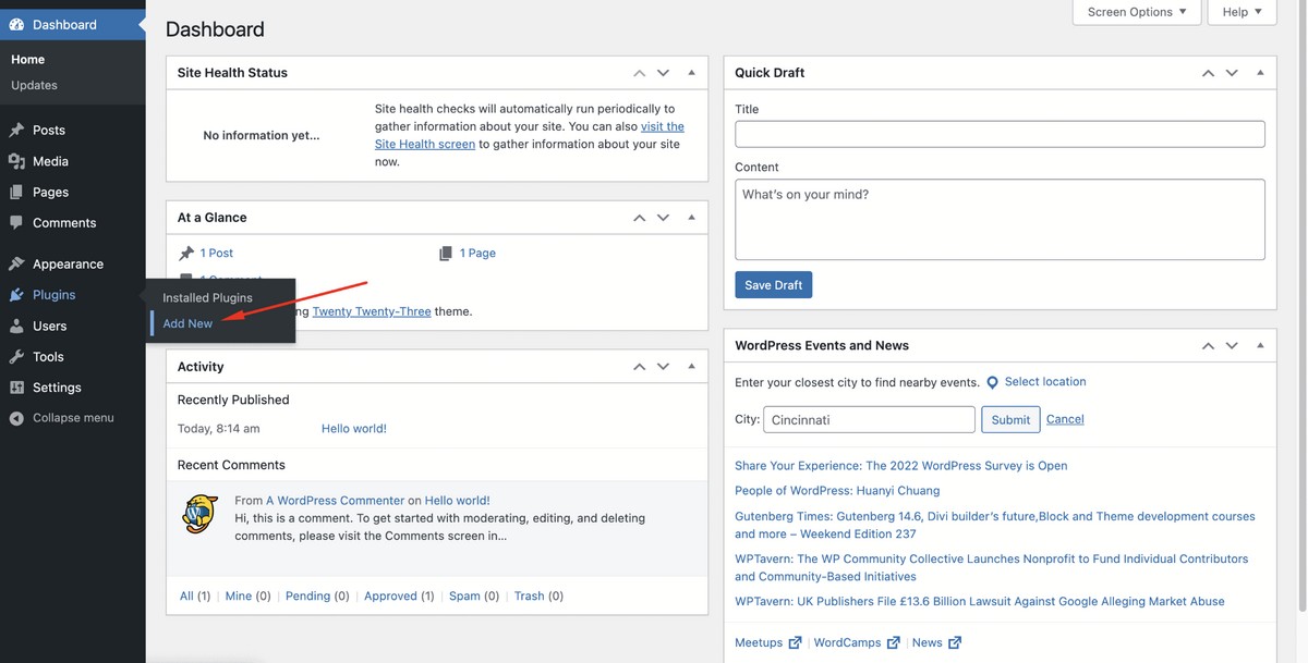
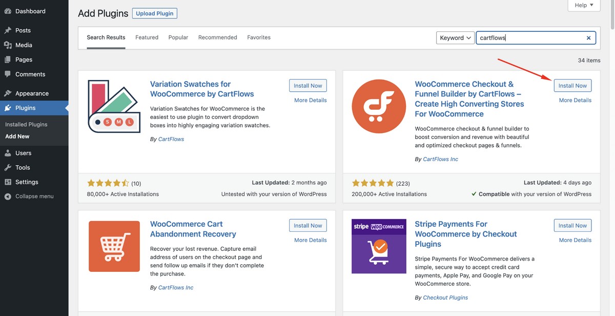
To install CartFlows, log in to your WordPress admin dashboard and head to Plugins > Add New.
Search for ‘cartflows’ and you’ll see the following product developed by CartFlows Inc.
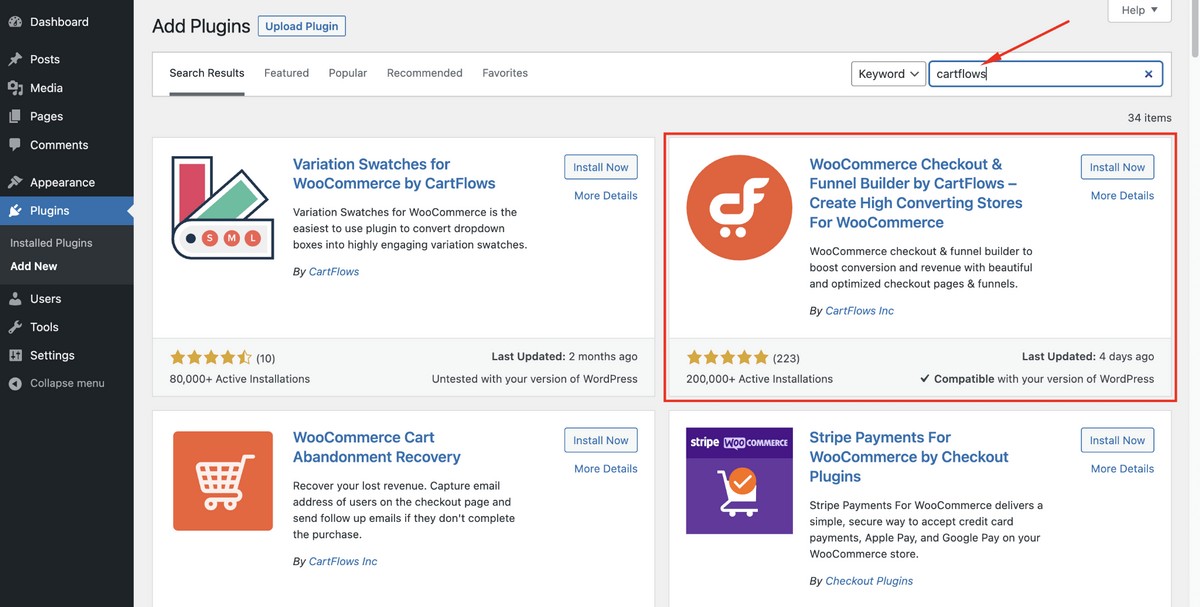
Click on the Install Now button.
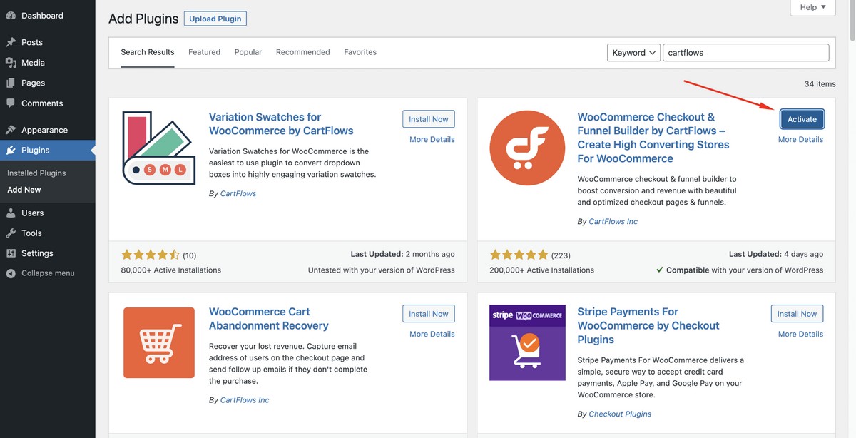
Hit Activate.
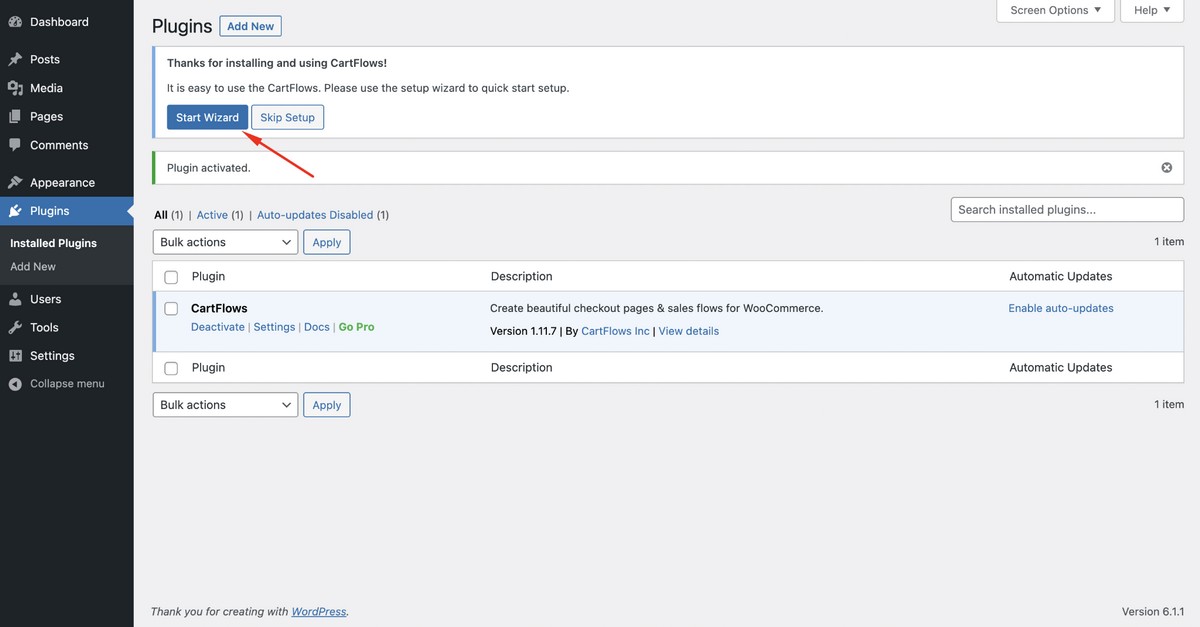
After the thank you message, select the Setup Wizard button to initiate some basic plugin settings.
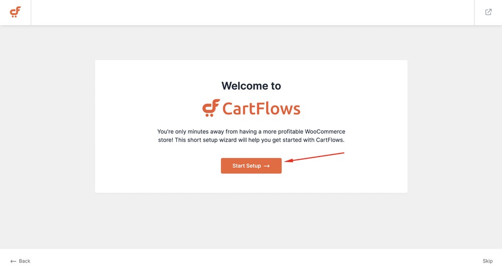
Click on the Start Setup button.
Select a page builder you like. We’re selecting Elementor for this tutorial.
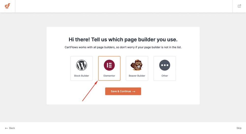
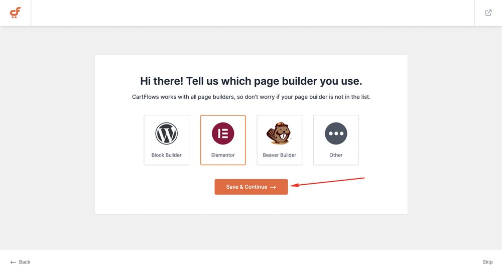
Hit the Save & Continue button to proceed further.
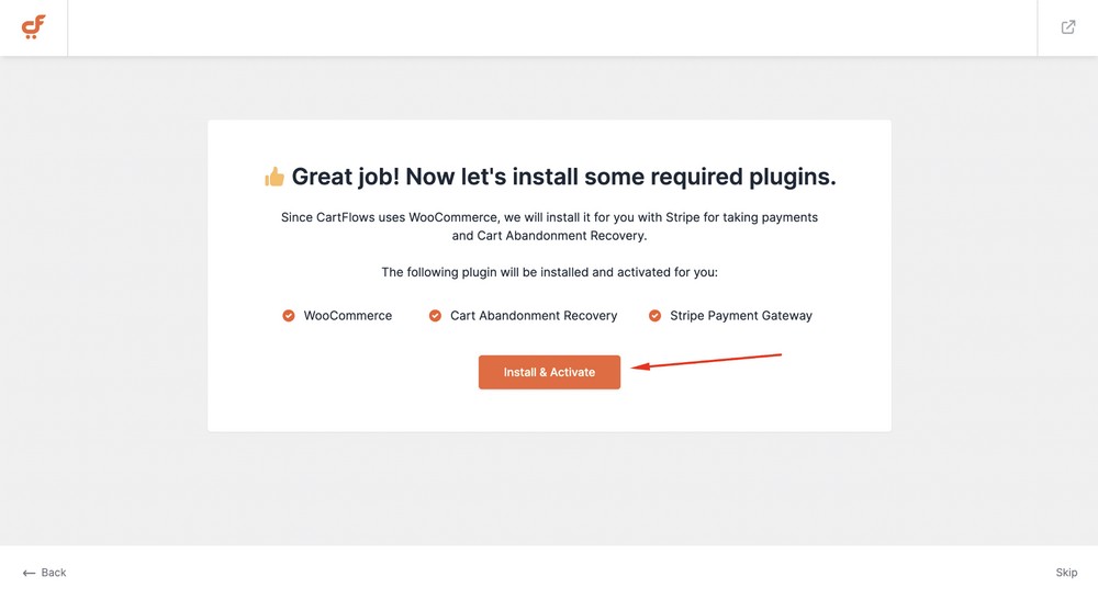
CartFlows will ask you to install other tools like WooCommerce, Cart-abandonment Recovery and Stripe Payment Gateway.
Hit the Install & Activate button to install them with just a single click.
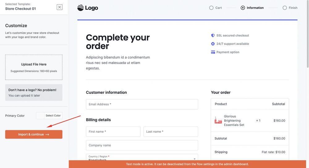
Select a checkout template for your store. In this case, we’ll select the first one.
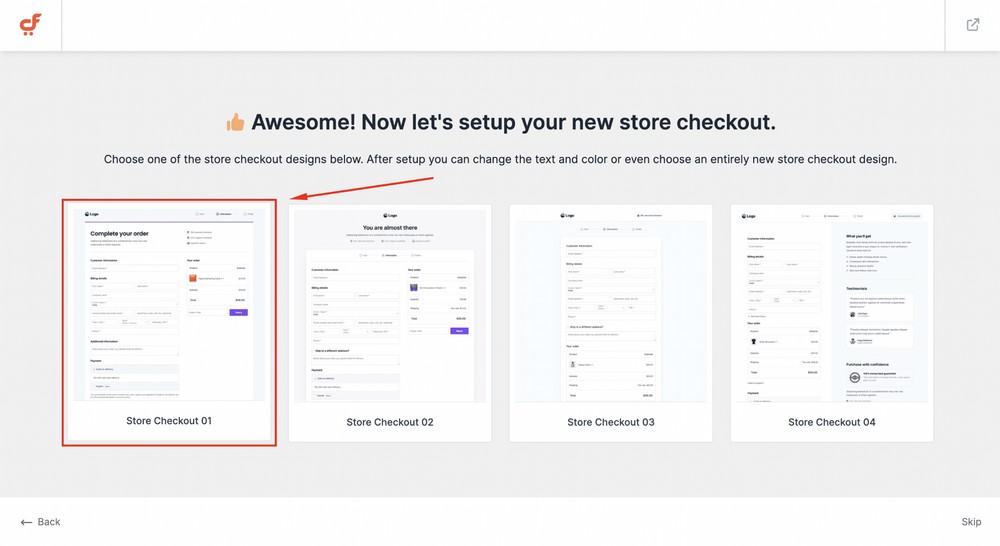
Select the Import & Continue button. Upload your store’s logo or skip it for later.
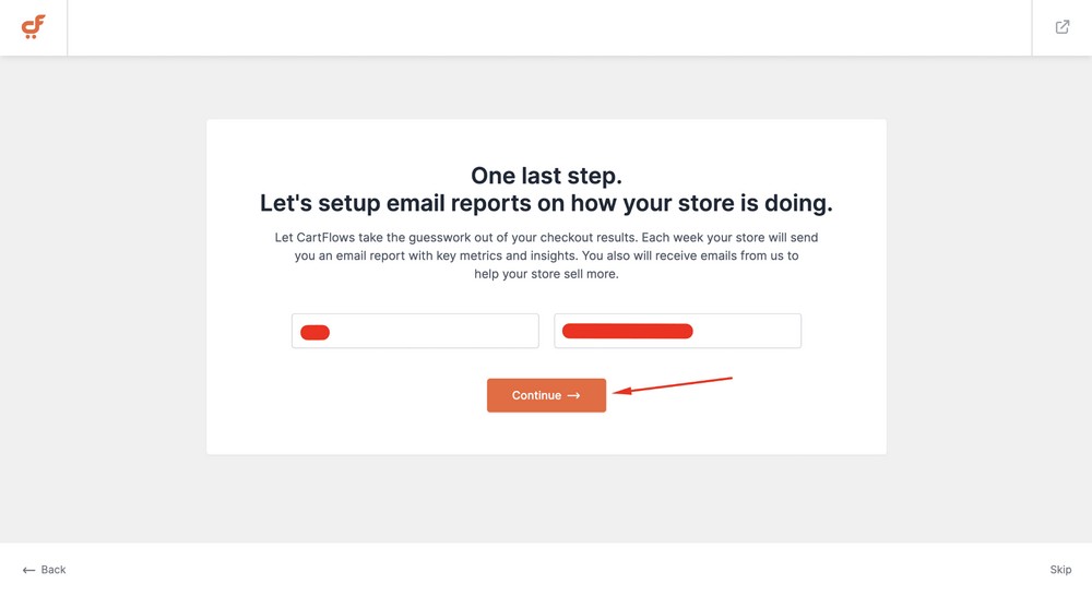
Insert your username and email and then hit the Continue button.
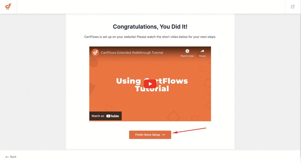
Now, click on the Finish Store Setup button to finalize everything.
Step 3: Import an eBook Landing Page Template
Now the basics have been covered, let’s install a landing page template.
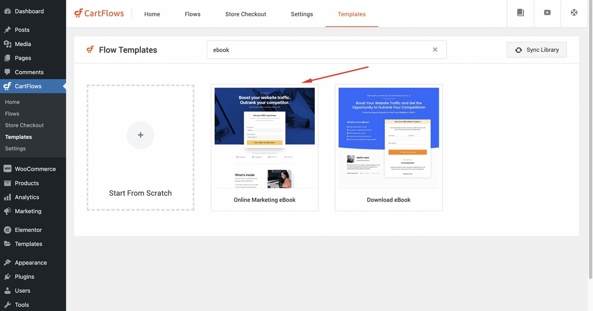
Select CartFlows > Templates and you’ll see a template library.
Search for the keyword ‘eBook’ and you’ll find a couple of templates.
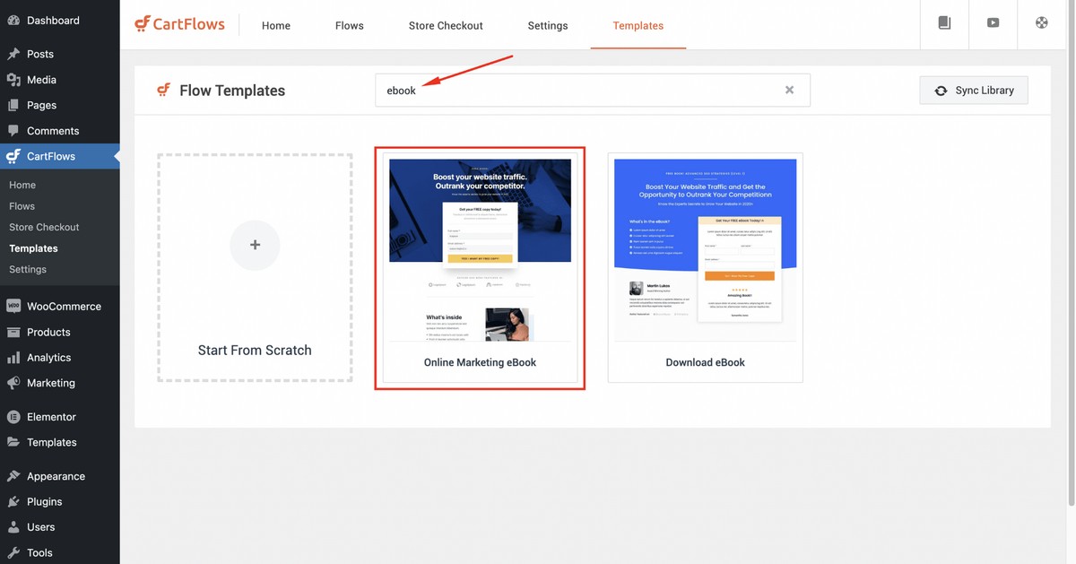
Select the Online Marketing eBook template in order to proceed.
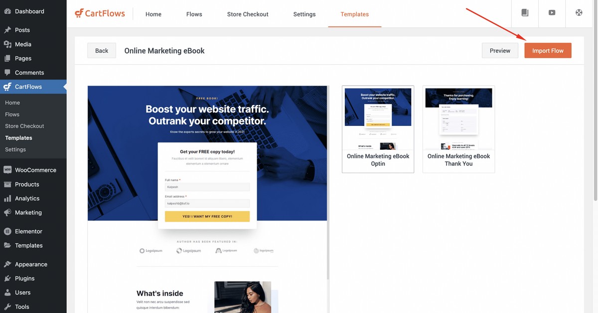
Click on the Import Flow button. (Flow just means sales process, which a landing page is a part of).
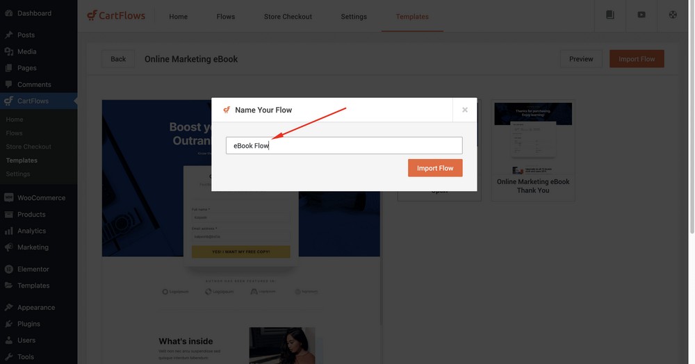
Next, you need to name the flow. We’re naming it eBook Flow.
Hit the Import Flow button.

Click Edit.
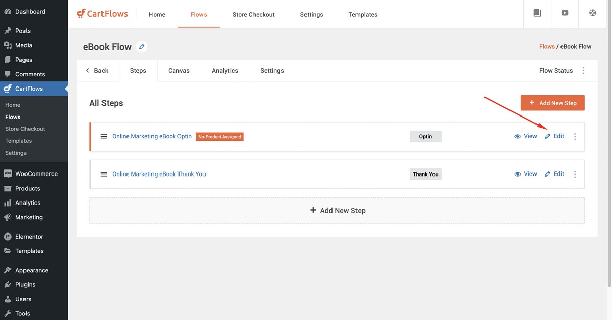
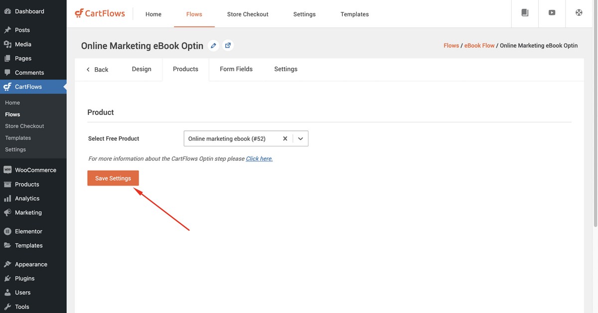
Now, select the Products option to add your eBook.
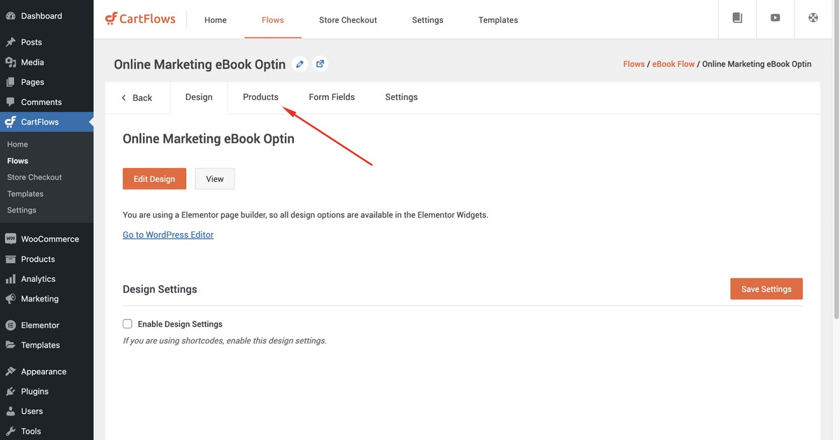
Type the keyword of your eBook (product) and then select the book you want to showcase on your landing page.

Important note!
To make the template work perfectly, make sure you navigate to the CartFlows tab and then select the flow (Here eBook Flow) for your eBook (product).
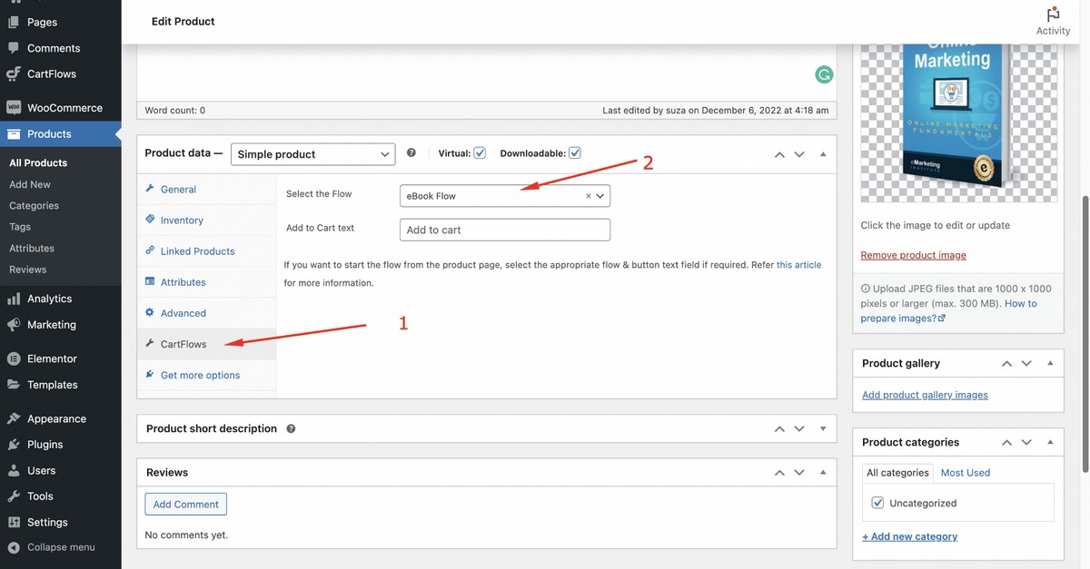
If you are using WooCommerce for the first time, chances are you may have yet to create an eBook product.
If so, follow these steps:
- Create the eBook product from the WordPress admin dashboard WooCommerce > Products > Add New.
- Select digital and virtual as attributes for your product.
- Set the selling price to 0 if you want to let the visitors download the eBook for free. This is an opt-in template so you can not take payments for your eBook.
- Upload the PDF version of your eBook.
- Publish the product.
If you’re using SureCart, the process is largely the same. By the end, you’ll have created a product, your eBook, listed it as free to purchase and made it available to download.

PRO TIP:
If you want to sell an eBook on this landing page, consider selecting other CartFlows templates that support eBook pricing.
Here’s an example of a template that supports pricing:
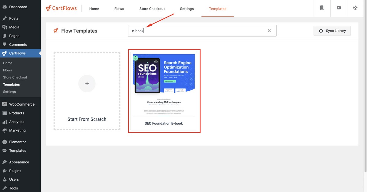
You can install this template and start selling your eBook right away!
Next, search for the keyword ‘eBook’ and add the free eBook to the opt-in.
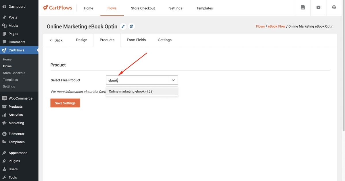
Finally, save your settings.
Step 4: Publish Your Landing Page
Now you need to publish your eBook landing page so it can begin working its magic.
Once published, you can add this page on your website’s navigation bar or leave it separate to form part of a marketing campaign.
To add it to your main site navigation, go to the WordPress admin dashboard and then Appearance > Menus to add it.
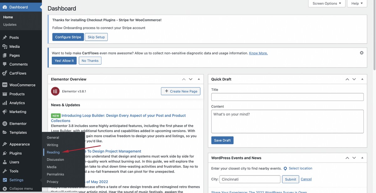
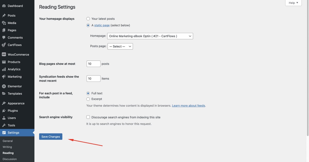
If you want to make it the main page of a dedicated eBook website, navigate to the WordPress admin dashboard and then go to Settings > Reading.
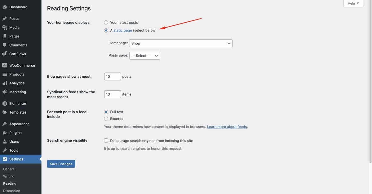
Now, select A static page option from the Your homepage displays section.
Set the opt-in landing page from the dropdown menu.
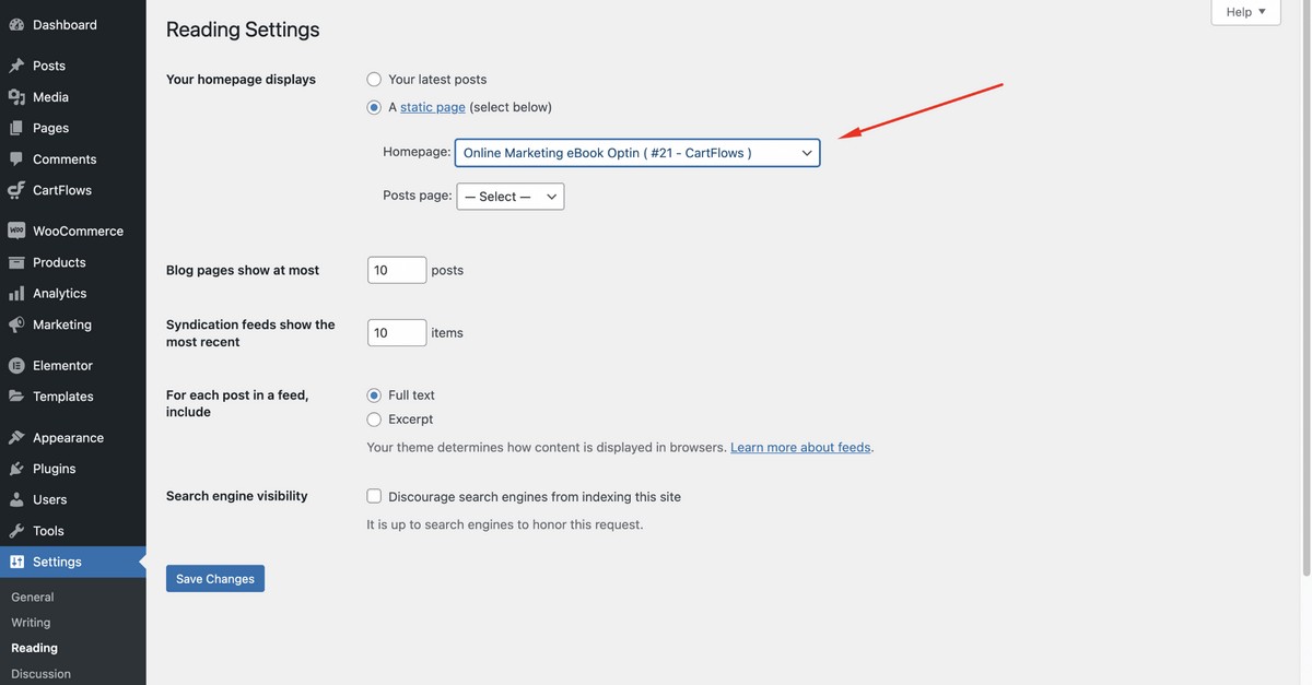
Save changes.
Step 5: Add a Payment Gateway – Optional
If you’re planning to sell your eBook rather than give it away, you now need to set up a payment gateway.
CartFlows supports all the same payment gateways that WooCommerce and SureCart does.
Feel free to configure Stripe, PayPal and other popular WooCommerce payment gateways with CartFlows.
For this tutorial, let’s configure Stripe.
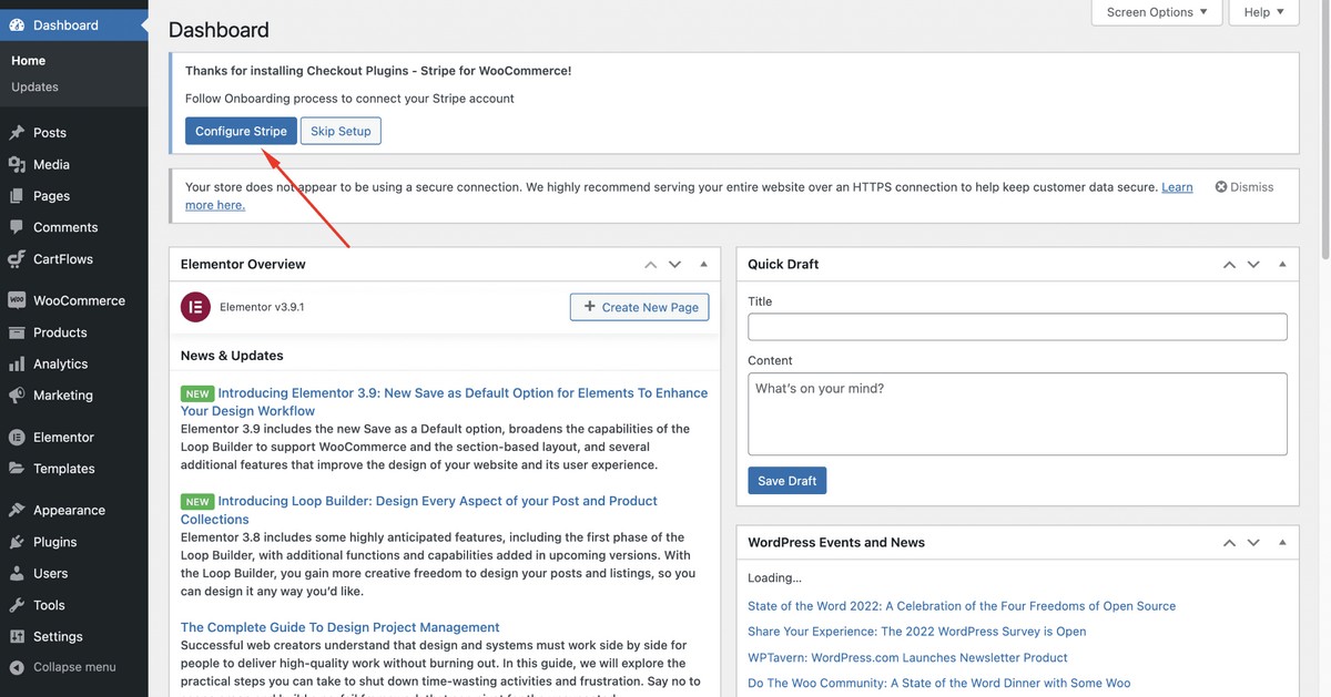
To do so, navigate to the WordPress admin dashboard then click on Configure Stripe to start the process. (You’ll get this notification when you install CartFlows for the first time.)
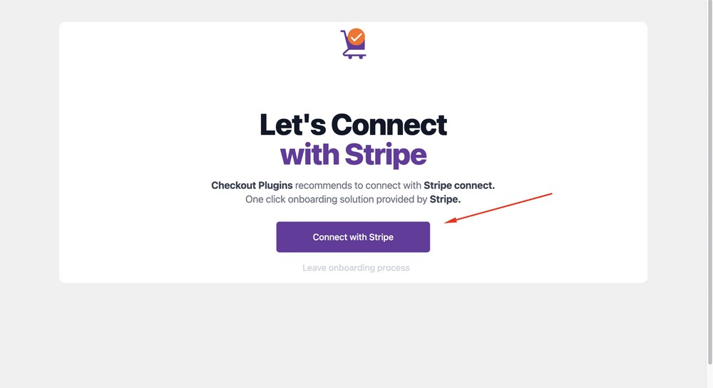
Click Connect with Stripe.
Insert your Stripe email address and proceed with the Continue button.
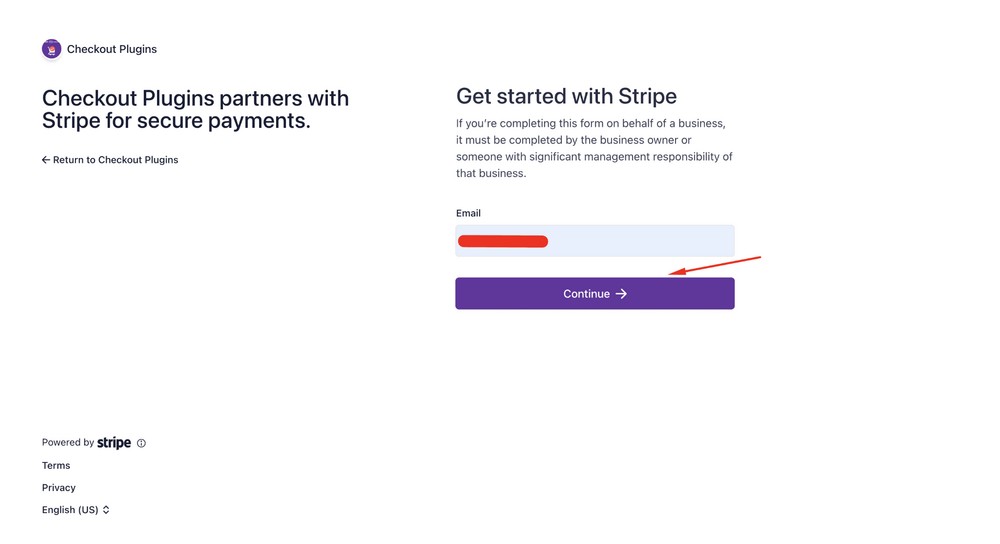
Hit the Connect button to connect your Stripe account with CartFlows.
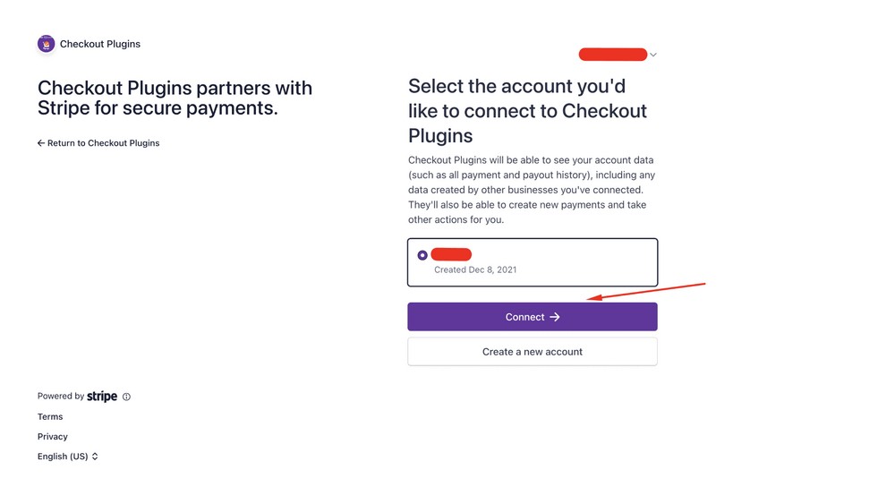
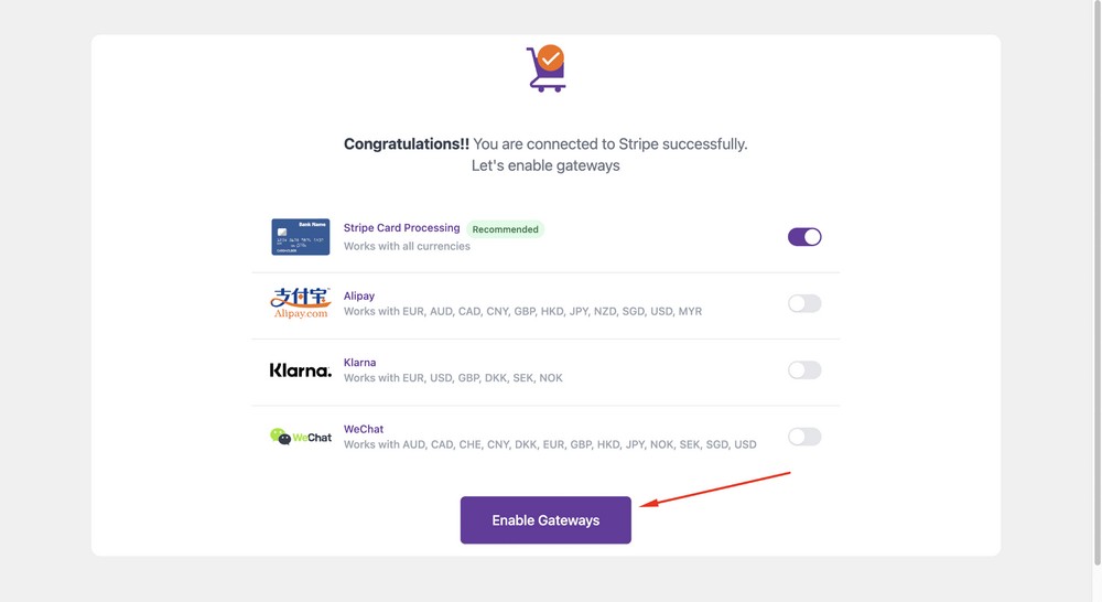
Click on the Enable Gateways button to proceed further.
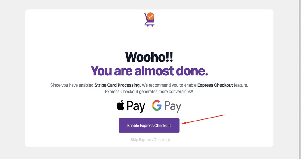
You can also Enable Express Checkout.
Express Checkout allows customers to quickly complete checkout without having to go through the traditional multi-step process.
Instead, they can enter their payment information on the same product page and complete the transaction automatically through a payment processor like Google Pay, Apple Pay, Amazon Pay or Browser Pay.
This can help to streamline the checkout process, making it faster and more convenient to make a purchase.
Select the Enable Express Checkout button to activate this feature.
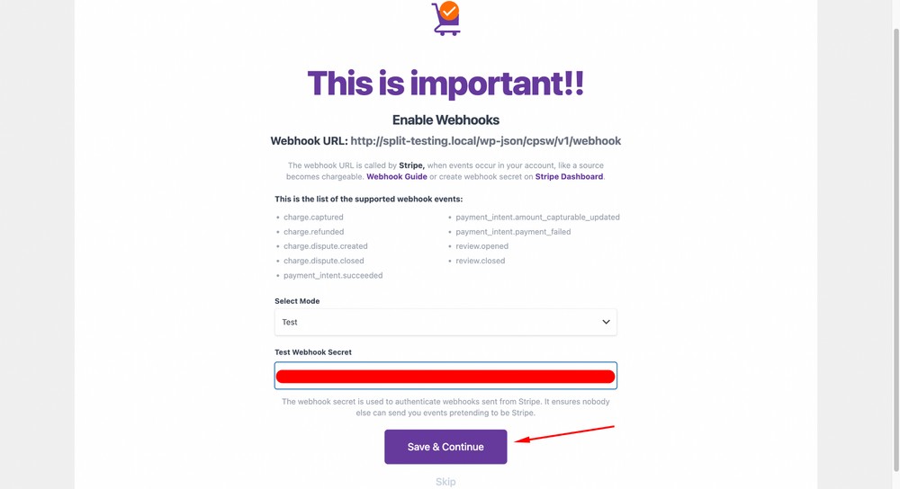
Now, you can use the test mode option from the dropdown to make sure everything works.
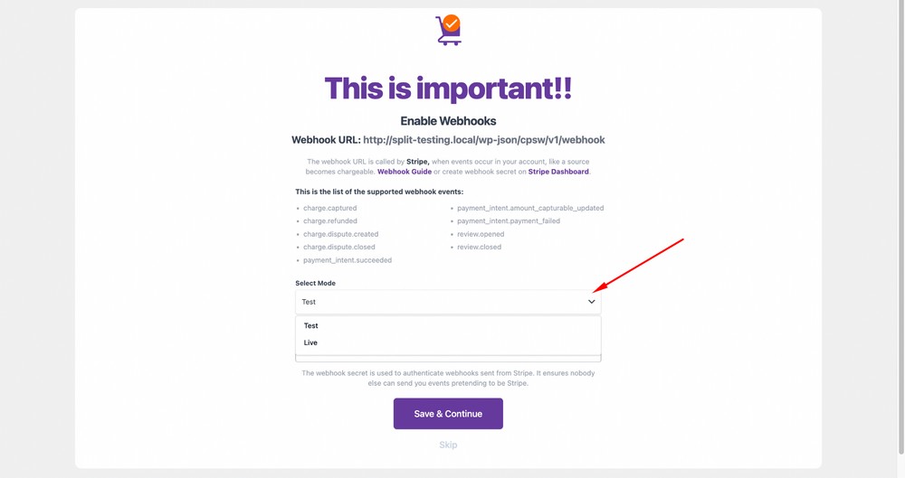
Next, collect and enter the Test Webhook Secret key from your Stripe dashboard. After that hit the Save & Continue button.
(Please note that, for live processing from customers, you need to use the live mode and live secret key.)
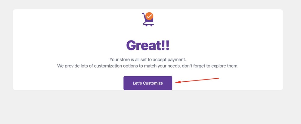
Congratulations, you’ve successfully configured Stripe!
View Your Landing Page
If you are wondering what your eBook landing page will look like, here’s a preview:
Bonus Tips: Advanced Customization
- You can customize the landing pages design using the CartFlows page builder.
- You can also customize the checkout form and the thank you page.
- To sell your eBook, you can install other templates such as SEO Foundation eBook Sales Landing or Business Hacks eBook Sales Landing.
- You can also export or import your templates or flow down the line so that you can use it on other websites.
eBook Landing Page Best Practices
Now you know what’s involved in creating a landing page for an eBook, let’s take a look at some best practices.
They could help you create an amazing landing page that performs well from the start.
Have a Clear Call to Action
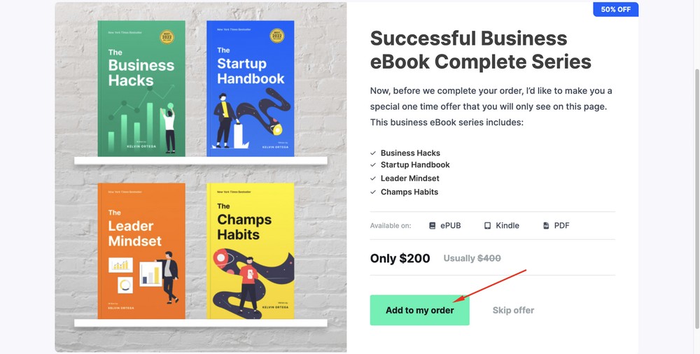
One key element to any successful eBook landing page is having a clear call to action (CTA).
The call to action should appear early on the page, once you tell about the book and give a strong reason to take the desired action.
By then, the visitor will be primed and ready to go.
Make sure you know what action you want the user to take after landing on the page – signing up for more content or downloading. Use a bold CTA like “I want a copy of this book”, or something simpler like ‘Buy now!
Use a Strong Headline To Hook Visitors
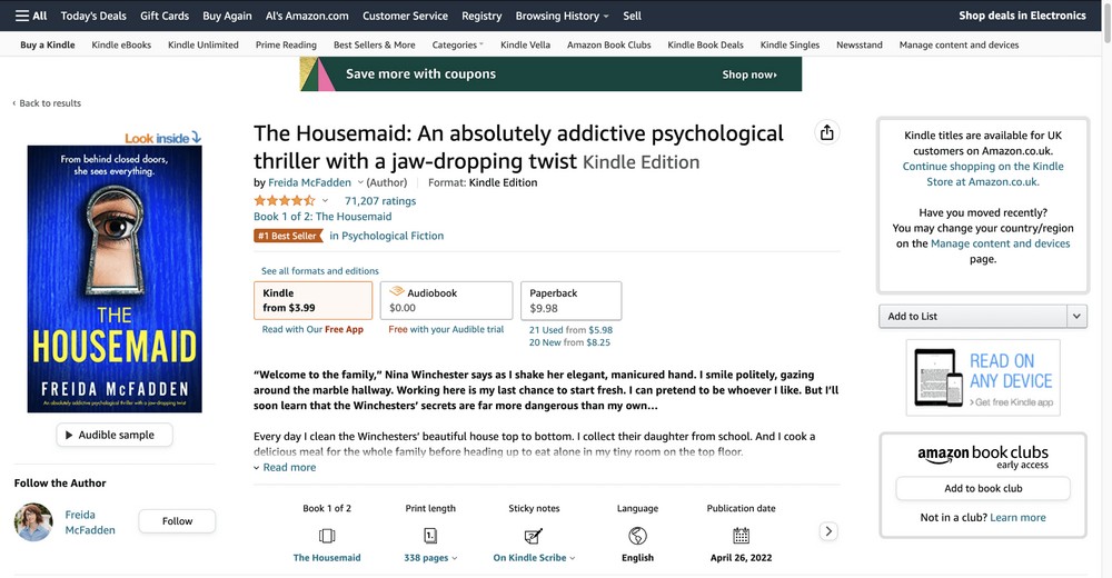
Just like your book title needs to hook a reader while describing what to expect, your landing page headline needs to do the same.
We recommend using a headline that will hook visitors and keep them reading.
Use language that captures the main benefit of the eBook so potential readers can quickly understand what they’ll gain by downloading it.
Additionally, provide a detailed description of what readers can expect from the contents of your book. This will help boost engagement and conversions as people better understand what they’re getting.
Include Eye-Catching Images
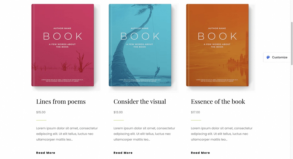
Quality images can help capture a potential customer’s attention and draw them further into the sales funnel. We like to see what we’re buying, even if visuals don’t have much relevance, like with a book.
The clearer idea we have of what we’re buying, the more likely we are to purchase.
Highlight Benefits Not Just Features
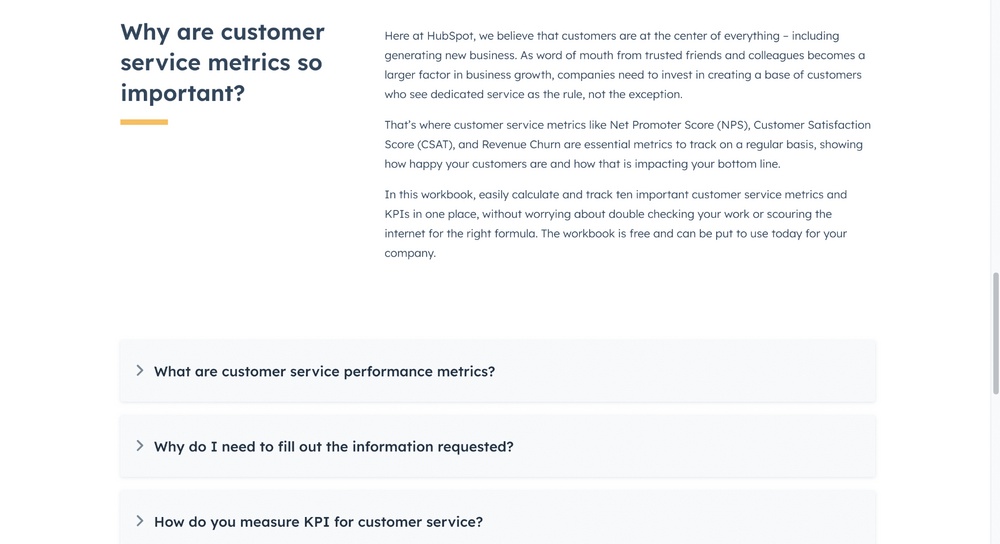
The most important step is highlighting the eBook’s benefits, not just its features.
People don’t usually download an eBook for what it does. They download it for how it makes them feel and how it can improve their lives.
Show them why they need this book, and they’re more likely to download it!
Build Trust Using Social Proof
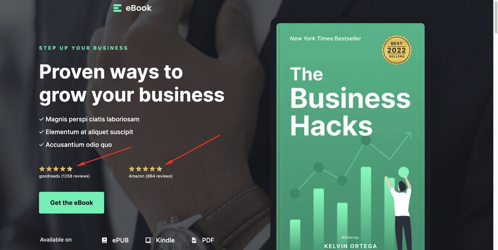
Social proof is a powerful tool for building trust and boosting conversions.
Here are a few examples of incorporating social proof into your eBook landing page:
- Think about how you can highlight customer reviews on the page. A few well-written testimonials can effectively demonstrate that people have had positive experiences with your books before. You could feature them near the call to action button, making them hard to miss.
- Social media widgets are also great tools for adding social proof to your eBook landing page. As long as there are positive comments on your networks, they can help build authority.
Have a Short Simple Lead Generation Form
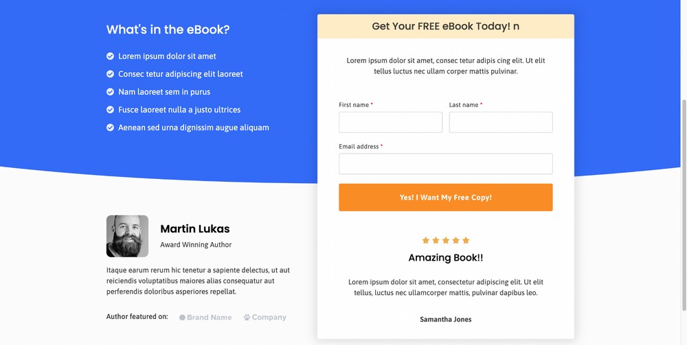
If you’re using an eBook for marketing, you need to approach the landing page slightly differently.
Rather than selling, you’re trying to encourage people to provide their email address or other information in return for a download.
For that, you’ll need a short and simple lead generation form.
Lead generation forms are designed to capture leads quickly and efficiently. Keep it short and sweet with only essential questions that won’t dissuade people from filling it out.
For example, ask for basic contact information like name and email address rather than occupation or job title – this kind of detail can come later.
Also, clearly explain what people will get when they sign up. Not everyone will read through your entire page before submitting their information!
Remove the Navigation Menu and Footer
Removing the navigation menu and footer elements is important so visitors focus only on the page content.
You want the visitor to focus on your key messages and not explore the rest of your site. Removing navigation is a simple but effective way to keep them on the page.
Wrapping Up
Creating a landing page for your eBook is an important step in the process of getting it to market.
If done correctly, it can help create credibility and trust with potential readers. It can also give people a place to go when they want more information or are ready to make a purchase.
Don’t forget to use design elements that draw the eye, such as compelling images and engaging copywriting, social proof and an optimized checkout process or opt-ins.
Finally, don’t forget to test different formats and layouts of your landing page until you find one that works best for your audience.
Do you use landing pages for your eBooks? Have any tips for others wanting to build one? Tell us your story below!
Disclosure: This blog may contain affiliate links. If you make a purchase through one of these links, we may receive a small commission. Read disclosure. Rest assured that we only recommend products that we have personally used and believe will add value to our readers. Thanks for your support!
