Improvement:
- Improved logic that is used to save the values of options inside the new popups, Earlier all the values of options inside the popup were combined and stored in JSON objects now all the values inside the popup are stored separately similar to Astra Version 1.X.X. This simplifies the upgrade process when users update to Version 2.x.x.
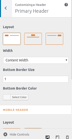
- Changed the images used in the customizer options such as Header Layouts etc. to new lightweight SVGs.
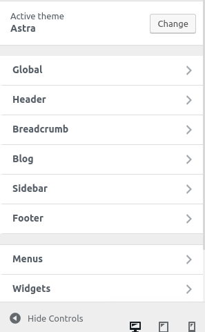
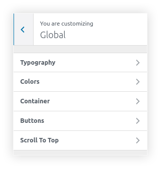
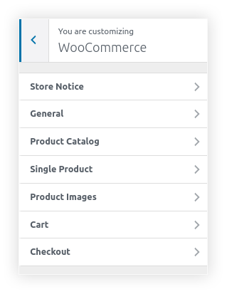
- Updated minor UI tweaks for all the customizer controls to unify the design across all the options.


